July is World Watercolor Month so I am featuring my Finetec Pearlescent Watercolour Set. I wanted these German-made paints to do calligraphy, but they can be used in a more traditional way, like adding a little sparkle to a sunset, some iridescence to a dragonfly wing, or an accent in the centre of a flower.
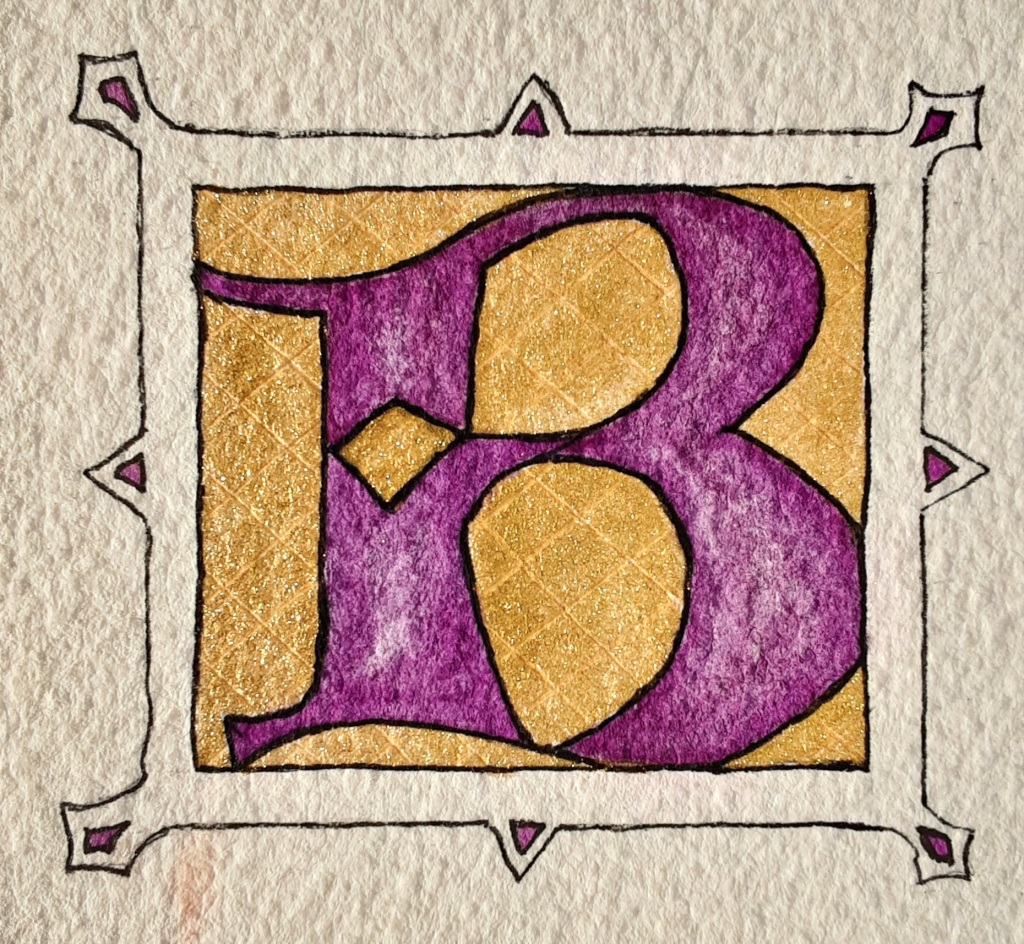
Medieval scribes would have used gold leaf on their illuminated letters but Finetec Arabic Gold 620 is a reasonable and more cost-effective alternative (done on Arches cold press 300 lb. watercolour paper and outlined with a Pigma micron pen)For this envelope, I moistened the paint and brushed it onto a calligraphy nibI did some test stripes in my Hahnemuhle sketchbook
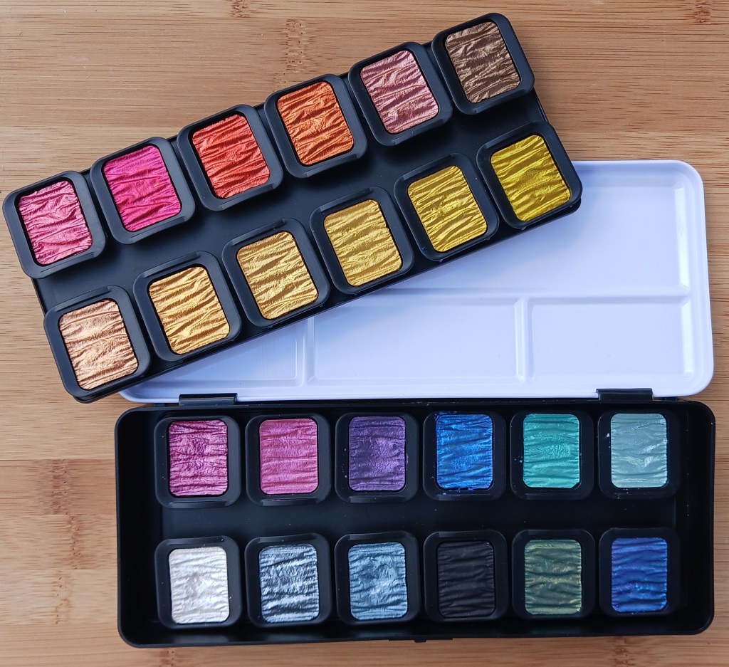
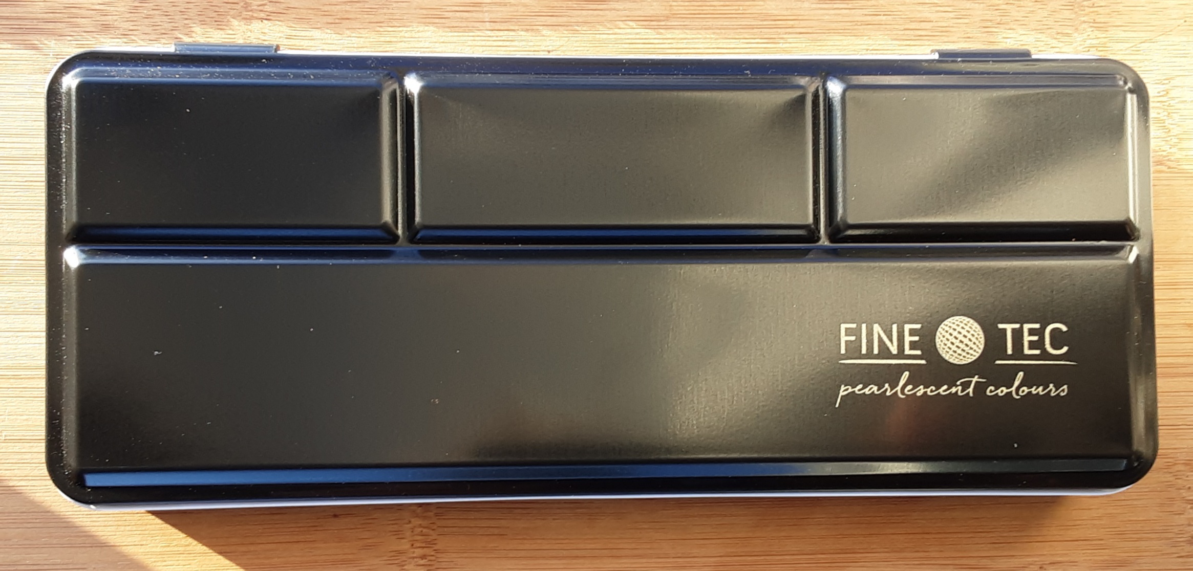
Just opening the box is like peaking into a treasure chest with the sparkly rippled paints inside. The tin lid makes a good colour mixing palette and then there are two layers of individual pans inserted into plastic trays.
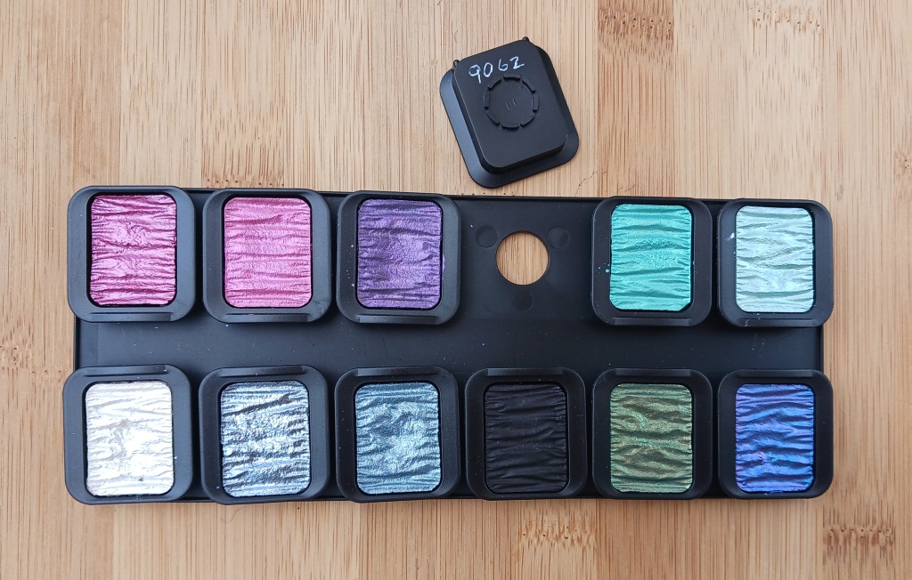
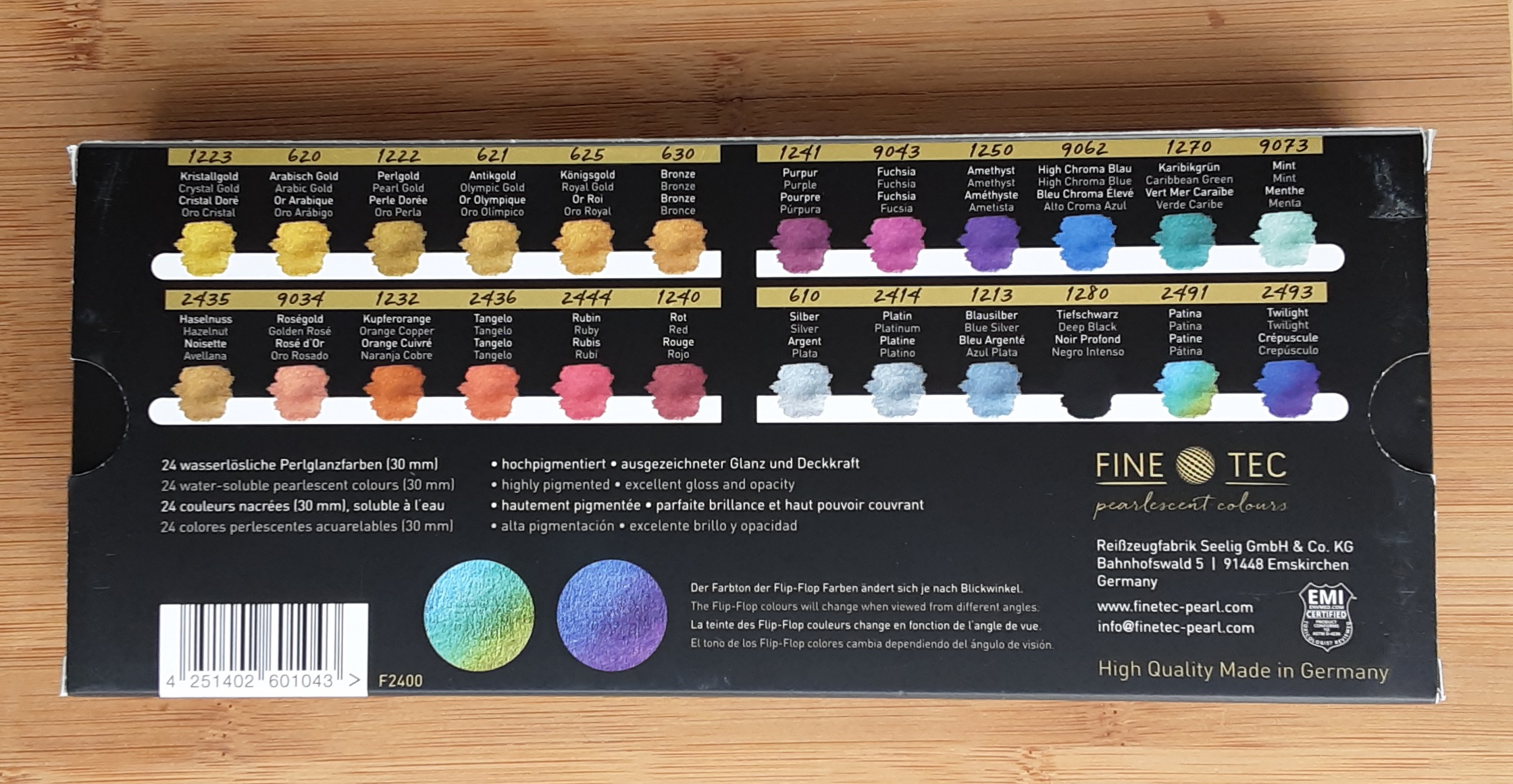
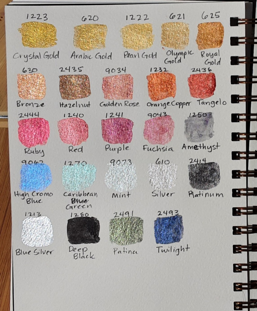
I wrote the colour number on the bottom of each colour using my white cat gel pen so I can remember which colour is which.
The individual pans pop out easily (a little too easily in my opinion). This makes it easy to replace just one colour if you run out or to reassemble the pans in some other way. The colour numbers are listed on the back of the cardboard box it came in.
I did test swatches on both black and white paper as the colours look quite different depending on the background. Except for the Deep Black, I think most of them look better on the darker background. It is hard to get a photo that captures how light affects the colours. In particular, Patina and Twilight magically change colour when viewed from different angles.
On Canson 140 lb cold press watercolourpaperSame page with less direct lightOn black Canson Ingres paper
If Finetec Pearlescent Paints were people, they would have two sides to their personality. Always colourful, sometimes they absolutely sparkle.
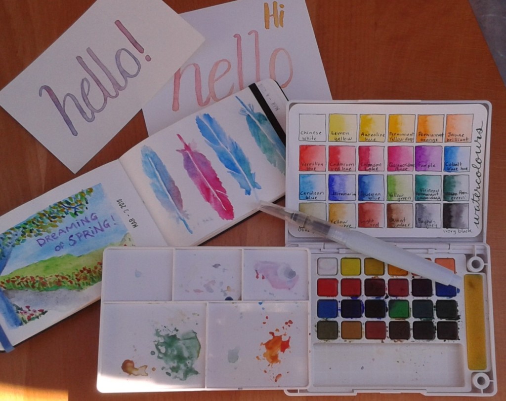
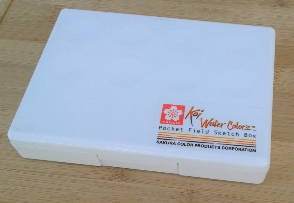
With all the social distancing going on due to the COVID-19 crisis, I have been doing a lot more art projects recently. One item I have been having a lot of fun with is my Sakura Koi Water Colours Field Set. Made by the Sakura Color Products Corporation of Osaka, Japan, this neat little set of high-end, student-quality paints has been my primary watercolours for over four years now. Sakura means cherry blossom in Japanese so it makes sense their logo is a stylized cherry blossom.
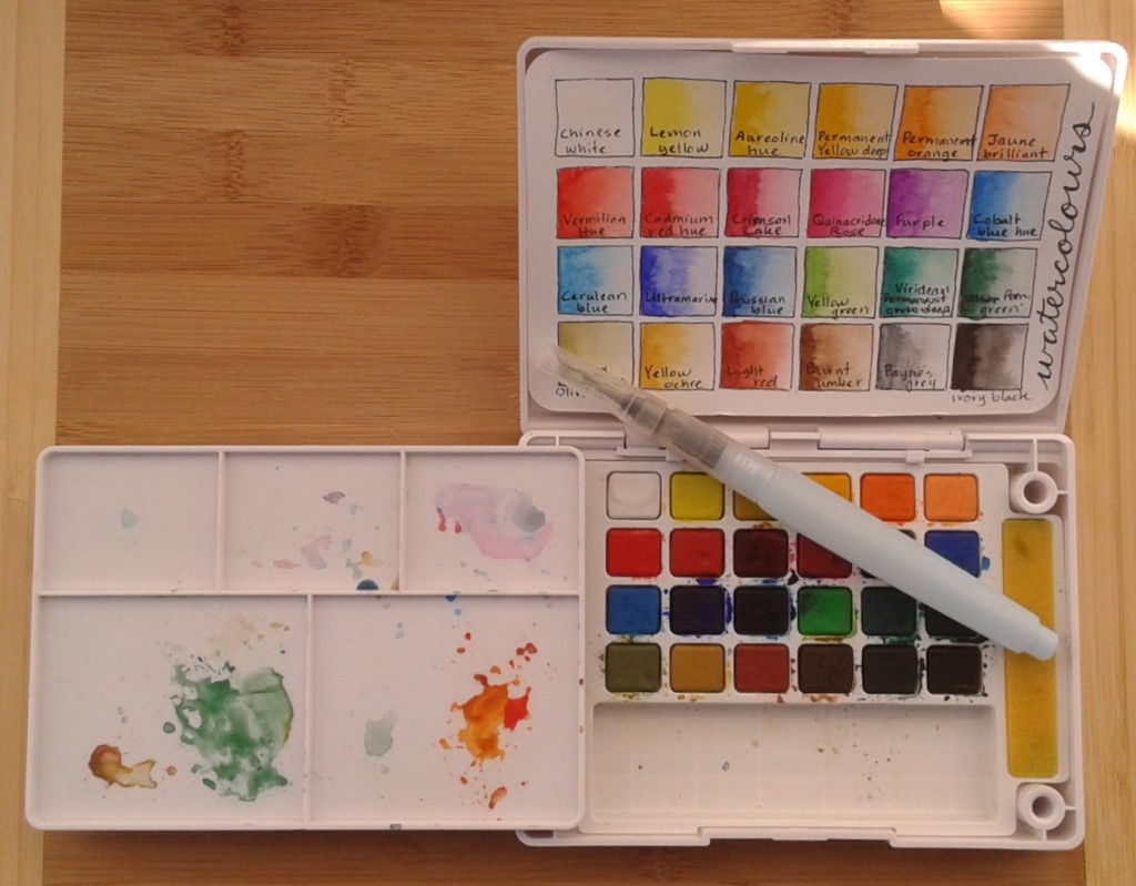
If you’ve been reading my blog over the years you have already seen many examples where I have used these paints. It’s designed to be portable so it’s usually part of my travelling stationery supplies. Sakura has other sets available but mine is the 24-colour size which measures approximately 15 x 11 x 2.5 cm (6.2 x 4.5 x 1.3 inches). I made a colour chart on a Hahnemuhle watercolor postcard that fits nicely inside the cover but you could also use the lid as a pallete or a little easel. The colours are very vibrant and I’ve found a little goes a long way.
Inside the box is a removable mixing pallete with little pegs that fit into holes in the corners of the paint set, which holds it in place when the box is closed. While painting, you can place it in two holes beside the paints making it adaptable for either right or left-handed painters. The sponges on either side of the paints are surprisingly useful to remove extra water from your brush and can be taken out and rinsed easily.
The set comes with a medium tip water brush. A water brush is a paint brush where the handle is actually a plastic reservoir for water. I like the idea but I haven’t really mastered the water brush. I’ve tried it for both painting and calligraphy but I’m never very happy with the results. Usually I just use a regular paint brush with this set. I’ve also never used the flip-down ring on the bottom of the box which is supposed to be handy if you are painting outside.
If this set was a person they would definitely be artistic. You can see them wearing a floppy hat while sitting on their portable folding stool doing urban sketching on a sunny day.
As I mentioned in my travelling
stationery supplies post, I took with me on holidays the Hahnemuhle
Watercolor Postcards I received in my prize pack from Life
Imitates Doodles. I decorated three postcards while I was away and they all
made it safely through the mail.
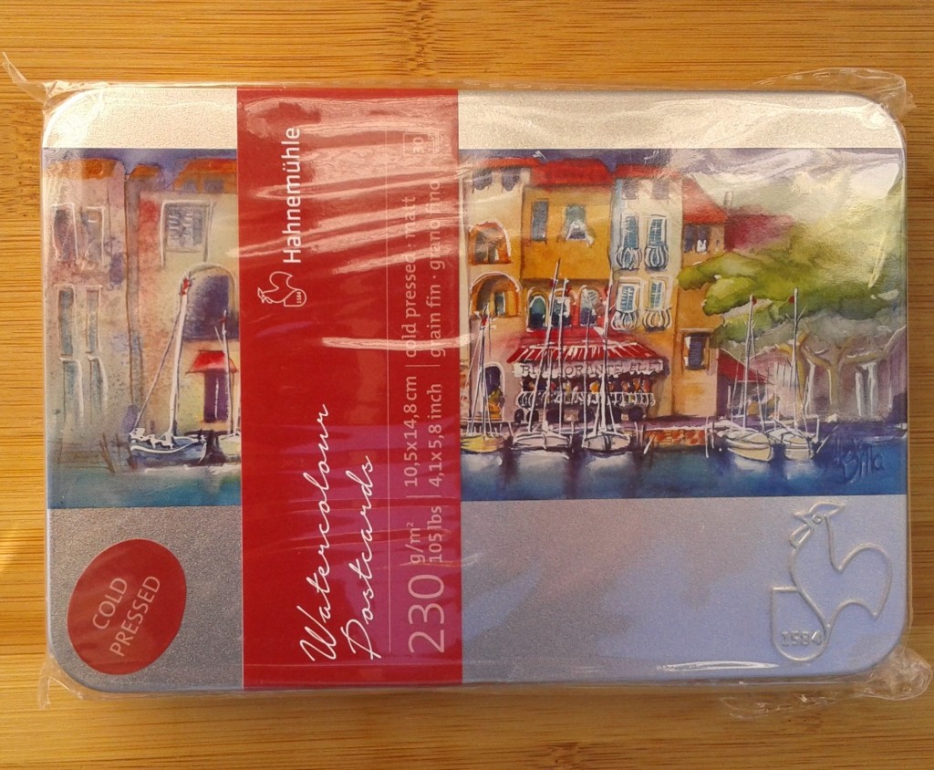
The Hahnemuhle postcards are made of good quality, slightly rough
surfaced watercolor paper about the weight of cardstock. Printed on the back is
a dividing line with a lined space on one side. I used the lined side for the
address but you could used it for the message if you preferred. The thirty
cards came in a nice metal tin but I only took a few with me rather than the
whole box.
I made three different designs using my Sakura Koi Water
Color Field Sketch Kit (24 colour size). For the first one, I tried to paint
the landscape as we went by on the ferry but I’m too slow at painting so it
doesn’t really represent any particular spot along the way.
I went for something more abstract for the second. It amazes
me how trees can grow in such rocky ground. I was reminded of the Arrogant
Worms song, Rocks and Trees. After painting, I used a Sharpie
to outline the shapes and draw the border.
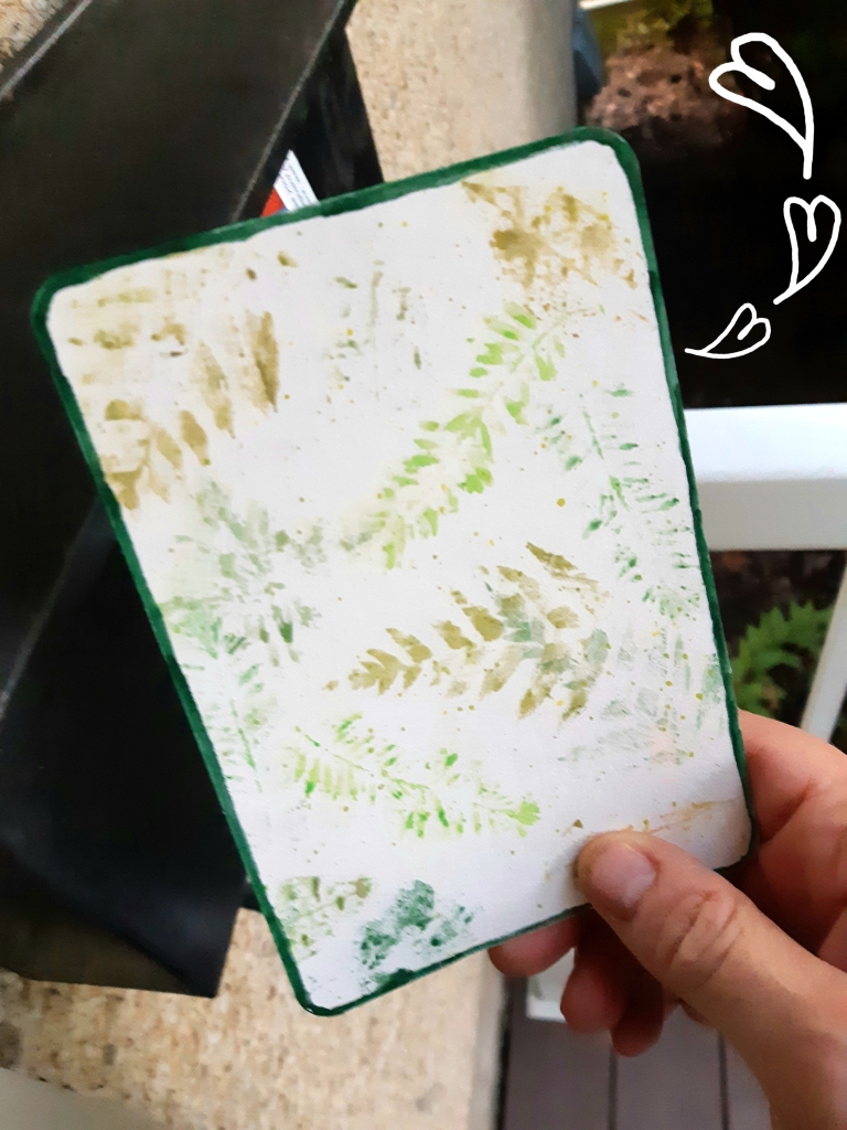
For my third postcard, I painted leaves and pressed them on
the paper to make leaf prints. I forgot to take a picture of the finished postcard
at the campground so here are a couple of what it looked like after it had been
through the mail. They are sturdy enough to hold up to Canada Post handling and
one made it through the US postal system too.
Thanks to Elisabet Ingibergsson for the after mailing images.
If these postcards were people they would be creative travelers
who still like to use the mail.
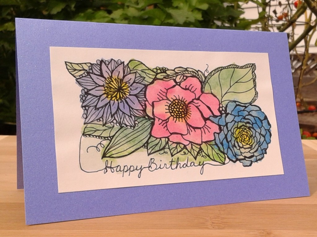
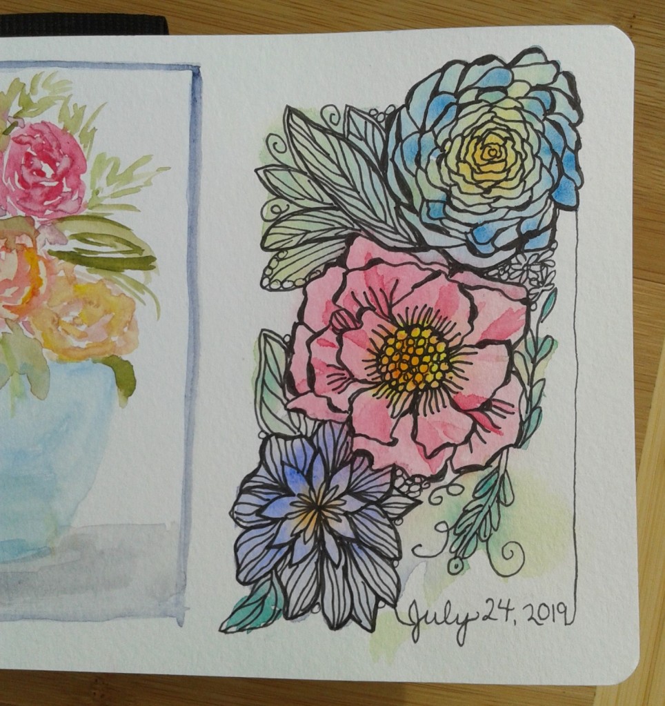
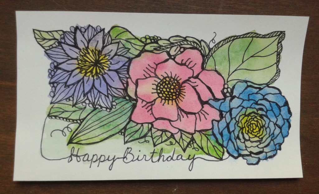
I made a birthday card last week inspired by a design I did in my Pentalic Aqua Journal earlier in the summer. I was pleased with how the sketch turned out and enjoyed making it and thought it would work well as a card design too. I used a small piece (7.5 by 13 cm) of smooth Arches watercolour paper mounted on some glossy periwinkle cardstock I had.
I began by painting a vaguely floral abstract with watercolour on wet paper.
Once dry, I used a black Sharpie pen to draw stylized petals and leaves. I didn’t want to overthink the design and try to base them on real flowers so I just started in the middle and added to it without much planning. I like adding a frame to my doodles to make them look more finished. It ended up being a horizonal design even though the one in my sketchbook was vertical. Somehow it just looked better that way to me.
I attached the little watercolour painting to the cardstock
with some double-sided tape but it didn’t want to stick to the glossy cardstock
so I tried again with my trusty UHU
glue stick which did work. Instead of just gluing some plain paper inside to
write a message, I used a sheet of wood
paper instead.
If this card was a person, they would be the cheerful and
easy-going type who never forget a birthday.
Earlier this week I participated in a mini-workshop with local Edmonton artist Karen Bishop to create a watercolour landscape on Yupo. Yupo is a very smooth, white, synthetic “paper” made by extruding polypropylene pellets. Yup, no trees are harmed in the making of this product. It’s hard for me to decide whether this is good or bad environmentally. The manufacturers say it is recyclable but I imagine most consumers and recycling facilities would not realize it’s plastic, not paper, so it would probably end up as a contaminate in the paper stream. As a plastic it will never decompose. Good quality watercolour paper is made from 100 per cent cotton paper, traditionally made from recycled rags, so I think it would come out ahead in the sustainability evaluation.
Yupo comes in packages and sheets
Yupo’s smoothness makes it very interesting to play with as the watercolour paints interact with it very differently than with paper. We experimented on a small (10 cm²) sample piece just to get an idea of how the paint would move and react on the paper. Since none of the pigment gets absorbed by the paper, the colours are much more vibrant than traditional watercolour paper and you can actually wipe it off the Yupo. It’s very hard to control what happens so you really have to loosen up and let it flow as it will. Watercolour on Yupo is not for perfectionists. You have to accept serendipitous results so it is more amenable to creating abstract works than precision illustration.
Test sample
We began doing a simple sketch on the paper. Everyone in the
workshop started off with the same idea of a large tree in the foreground with
a lake and mountain in the background (except for a little boy who had come
along with his mom and created, what appeared to be, space ships and
dinosaurs). Despite the same theme, the end results were very different.
Most of the participants used a pencil to make the sketch but as you can’t erase on Yupo (erasers remove some of the smooth finish), I thought I may as well just go with pen. I used a very nice black Pitt artist pen with a fine brush tip made by Faber-Castell which the instructor provided.
Once the sketch was complete, we began adding colour with some Holbein watercolours. As is usual with watercolour painting, we started off light and added deeper colours later. About halfway through, we took a break to let some of it dry before continuing, otherwise the colours would continue to blend and flow on the Yupo.
Midway through the process, see final result at top of blog post
It was fun to experiment with Yupo but I’m much more
comfortable with regular watercolour paper.
If Yupo was a person it would be very modern but a bit superficial. They love to wear bright colours and spend their money on the latest in new products.
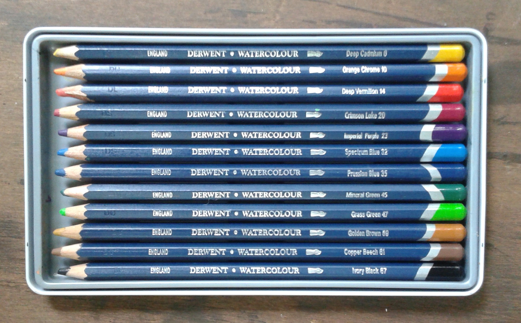
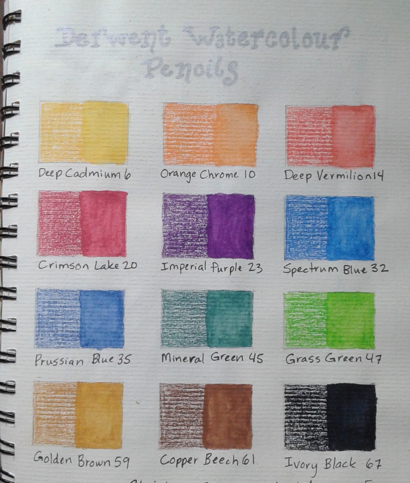
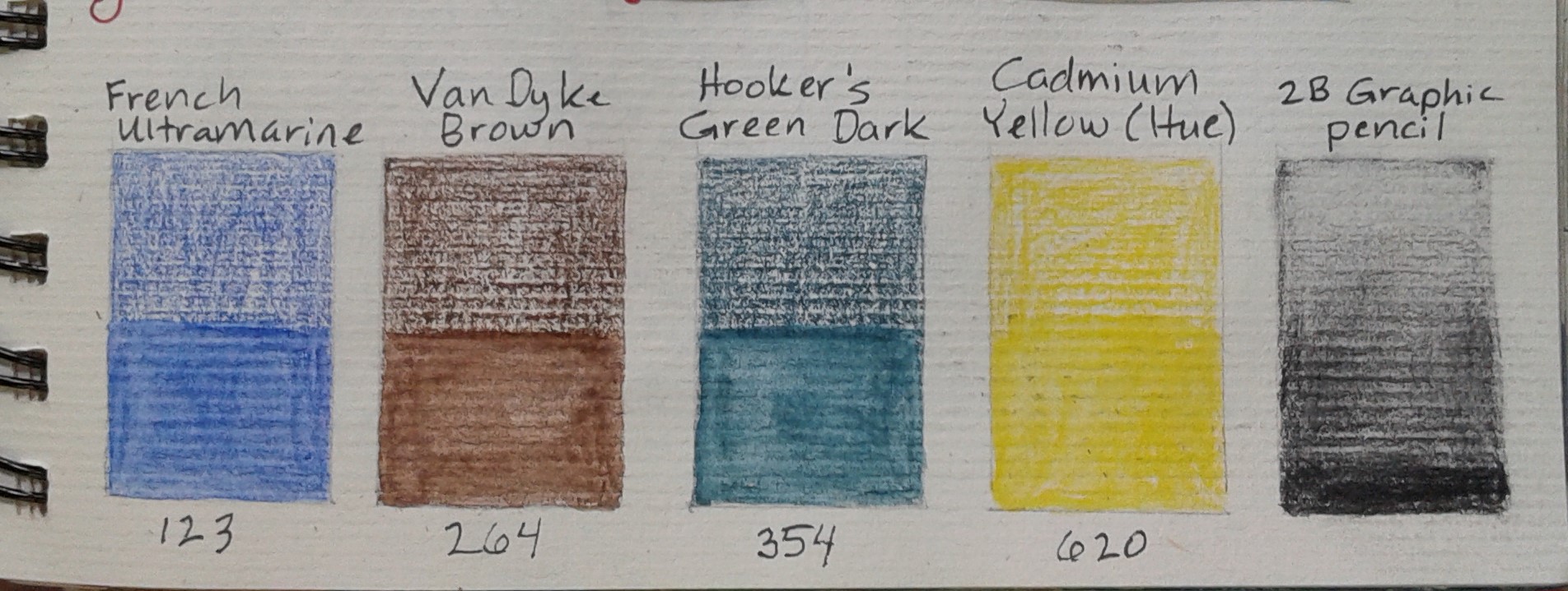
I recently watched the 2012 filmSightseers, a dark British comedy/horror about a couple going on a camping trip around England. One of their planned stops is the Pencil Museum in Keswick (now on my must-see list). This museum is run by the Derwent Cumberland Pencil Company. Although this company is now owned by a large multinational called ACCO Brands, it has a long history and they still make pencils in Britain (the only pencil company still manufacturing there). The only Derwent pencils I have in my pencil collection are watercolour pencils.
Watercolour pencils are pencil crayons with a water-soluble core, so while they work great dry, the colour really intensifies when wet. You can wet them by either dipping them in water or colouring first and then use a paint brush to dissolve the pigment. You can also wet the paper first and then colour on top but I don’t really like the results from that method. My set of 12 pencils has a good basic range of colours and came in a nice metal box that makes them easy to travel with.
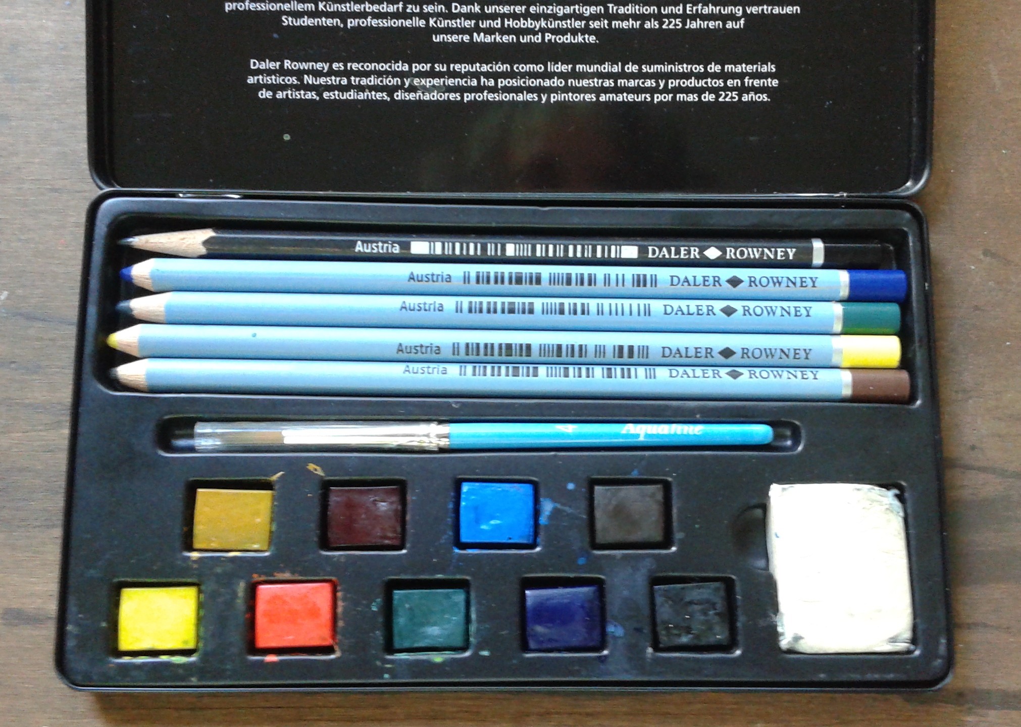
I also have four Daler Rowney watercolour pencils that came in a set with other art supplies that are meant for outdoor (plein air) painting so are in nature inspired hues. Daler Rowney is another company with British roots but these pencils were manufactured in Austria.
I feel both brands of watercolour pencils are good quality but I enjoy the larger range of colours in my Derwent set.
If watercolour pencils were people, they would be thin and love to travel. They seem uptight but give them something to drink and they really go wild.