Pilot Vpen

with caps

I tried out a lot of pens for my coloured pens blog a couple of weeks ago. One pen that really stood out was the Vpen (also known as the Varsity) made by the Pilot Corporation. This company is the largest and oldest pen manufacturer in Japan. It was founded in 1918 as a fountain pen company but now makes all kinds of pens.

With its cap on, this pen looks like any other regular pen. Remove the cap and you see the difference – it has a fountain pen style nib. The plastic barrel of the pen itself is not particularly attractive, but the stainless steel nib is good quality. While one of the benefits of writing with a fountain pen is that it is reusable, they tend to be more expensive than standard pens and need to be regularly re-filled with ink. This pen is a good way to try out a fountain pen without the expense. It would also be convenient for traveling as you don’t need to bring along an ink supply.

The ink of the pen I originally borrowed was what the manufacturer refers to as light blue. Personally I think that turquoise is a more descriptive name for this vibrant shade of ink with its lovely sheen. I was curious as to what some of the other colours would look like, so I put down my $4 CDN each to buy some for myself.

Although the Pilot Company wasn’t very creative in naming the light blue ink, they call their purple ink, violet. It is a nice readable shade of deep purple.

It is hard to be descriptive about black ink. This one is a dark, serious shade that would do credit to any signature.

writing

The Vpen writes smoothly on all types of paper but smudged a little on the very smooth Rhodia paper. The line is medium with no feathering or bleeding.

I grew up with someone who is left-handed so I know they have “special needs”. As this the Vpen was originally lent to me by a leftie, I can safely say that this pen is approved for use in both the right and left hands.

Overall, the Vpen is an excellent pen even if it is disposable. Thanks Neil, for introducing me to it.

If the Vpen was a person it would be someone who looks and seems ordinary when you first meet them, in fact you might not even notice them at all. It is just when you get to know them that their sterling qualities shine through.

Why are pencils yellow?

not a yellow pencil

Last week I mentioned that I had been asked two questions. The second question was why are pencils yellow? My first response is that clearly not all pencils are yellow (please refer to previous pencil blogs blogs part 1 and part 2). My own favourite is the Berol turquoise. However, if you have spent a lot of time in North American classrooms, in a trivial example of confirmation bias, you may be under the impression that pencils are for the most part yellow and there is a reason for that.

Where it all began...

Cast your minds back to Paris in 1889, where they celebrated the 100th anniversary of the storming of the Bastille with a world’s fair. The Eiffel tower was built as the entrance arch to the fair and the major attraction was a “Negro village” with 400 people. For pencil lovers however, this fair marked a huge change in the look of pencils. Before this time, pencils had a natural wood finish so you could easily see if there were any imperfections in the wood. The Czech Hardtmuth pencil company wanted consumers to focus on the quality of their graphite which they sourced from Siberia. The marketing geniuses of the time figured that since Siberia bordered China, and yellow was the Emperor’s colour of imperial China, they would paint their pencils yellow. In case people didn’t get the regal reference, they went the extra step to name their pencil “Koh-I-Noor”, the same name as the large diamond Queen Victoria was “gifted”  during the British Raj. Both graphite and diamonds are carbon so maybe it wasn’t such a stretch to name the pencil after a diamond. At any rate, the marketing worked, the pencil was a success, and American pencil companies like Dixon Ticonderoga picked up on it. Even today, generic pencils are often painted yellow.

If yellow pencils were people they would just consider themselves ordinary and never have the curiosity to delve into their family tree to discover their ancestors’ past pretensions of royalty.

Thanks again to Deirdre and Jasmine for the question and to Elisabet for the pictures.

What is your favourite ink colour?

Last month I received two questions from actual readers of this blog (no, I am not so desperate for topics that I am making up questions). I am away on holidays so I prepared answers ahead of time.

The first question was, which do I prefer, blue or black ink? My answer is why limit yourself to just blue or black. Thanks to modern chemistry there is a whole spectrum of ink colours to choose from. While not all of them may be practical or appropriate for an office setting, there is something to be said for going for a distinctive shade. Here are some options:

Black

Black1

Black is a very traditional colour for ink and is sometimes required for use on forms. It is a very common colour for pens so I was able to round up a lot of them for my comparison. I was a bit surprised how much black inks vary in tone, some are much darker than others. I couple of these pens I have discussed before (Sharpie and Pilot FriXion). The Pelican Techno-Liner and Staedtler pigment liner I use more as drawing pens even though they write very well. The big surprise for me was the Papermate Inkjoy gel pen. I have tried the Inkjoy ballpoint pens and while they are fine for cheap pens, really nothing special. The gel pen version of this line is great. The barrel is a bit on the fat side but the writing is smooth and the ink very dark.

Blue

Blue1

I was surprised at how few blue pens I had in my stash as generally I think of them as very common. I have given my opinion on the Sharpie and Inkjoy before and really there is not much to say about the Pentel RSVP. It is a very basic ballpoint stick pen with a nice rubber grip but not much to write a blog about. This one is a medium (1.0 mm point size) and writes fairly smoothly but like most ballpoints there is some unevenness in the line.

Turquoise

turquoise1

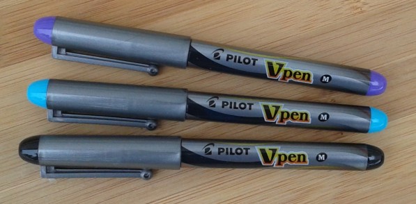
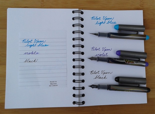
I wondered about including the Staedtler fineliner as I use it as an extremely fine marker more than as a pen but it does write well and the slightly triangular shape of the barrel stops it from rolling around. The Zebra Z-grip and the Inkjoy I have discussed before but the real find here is the Pilot Vpen. It deserves a blog of its own in the future. It is a disposable fountain pen which would be great for anyone who wants to try out a fountain pen without shelling out a lot of money. The colour of the ink is dark enough that I would consider this the only one of this group that could be taken seriously as a pen.

Brown and orange

Brown2

The paleness and lack of gravitas of the orange pen make it pretty obvious why there are not a lot of orange pens out there but I was a bit surprised at how few brown pens there are. Brown was a traditional ink colour (think of ancient manuscripts) and can be quite readable but just doesn’t seem that popular.

Green

Green1

I had so many green pens to include I could hardly fit them all on the page. I have no explanation for this as I wouldn’t have thought it would be that common a pen colour. In its darker forms, green is a very attractive and readable ink. I liked the smoothness of the Pentel Slicci but the thinness of the barrel makes it less comfortable to write with. The Pentel Energel was more comfortable but slightly less smooth to write with. The metallic sheen of the gel pen puts it into the novelty pen category but it is still very readable.

Purple

Purple4

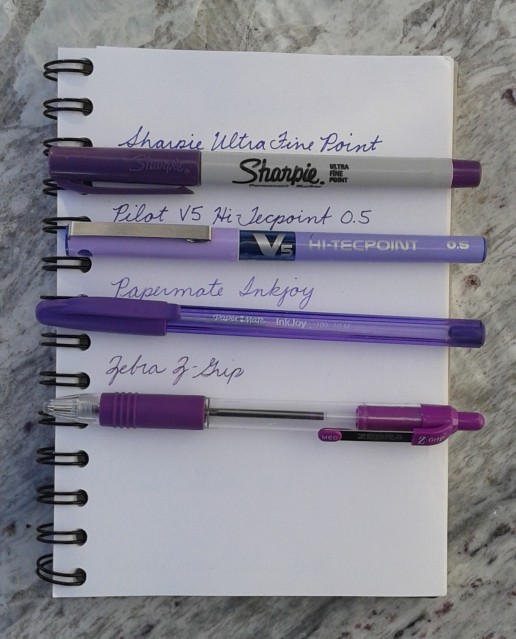
Purple is another colour I think can be taken seriously as an ink providing it is dark enough. After all, it was good enough for Byzantine royalty to sign their edicts with. I actually use the purple Pilot V5 Hi-Tecpoint all the time at work and have had no indication that people are laughing behind my back because of it.

Red

red2

I rarely use red because it reminds me of teacher’s pointing out mistakes so I was surprised at how many red pens I was able to round up. Of these pens, the Pilot V5 Hi-Tecpoint provides the deepest colour and smoothest line.

Pink

Pink3

Pink is a nice cheery colour but it just seems too childish to be taken seriously as an ink. The Bic pen is a novelty pen that originally had four colours, turquoise, purple, light green, and pink. Of course, the turquoise and purple got used up first because what do you want to write in light green and pink?

If these pens were people they would be a mass of humanity. Different colours, strengths and weakness but really as they are all pens they have more in common than differences.

A shout out to Neil for lending me a number of his pens (including the wonderful Vpen) to include in my tests and to Deirdre and Jasmine for the question.

Grumbacher sketch books vs Canson drawing paper

20171104_115254

When I was making my Halloween card envelopes, I found two old Grumbacher sketch books. (Fun fact: Jackson Pollock used Grumbacher sketch books). The larger one (actually called a sketch pad) is from my university days so dates to the 1980s and the smaller one appears to be even older than that. They both are labeled Artcraft (trademarked in 1923 but now expired, another victim of corporate takeovers) but the fonts and graphics are quite different. While the older book features a very traditional landscape sketch and a bright orange cover, the one from the 80s calls the paper multi-media, has no illustration and is a much more muted shade. Both  books also are labeled “kid finish” which, according to the dictionary, means it has the surface of undressed kid leather. That certainly seems like an anachronistic description as I don’t know anyone who would have any knowledge of what undressed kid leather would feel like.

Enough about the covers, what about the paper? The older Grumbacher paper is slightly heavier than the 1980s version but both have more heft than the Canson sketch paper I discussed in an earlier blog. I wondered how they would compare to the next paper in my sample book, the Canson drawing paper. The drawing paper is more substantial than any of the sketch papers. I have to admit I didn’t really know the difference between sketching paper and drawing paper until I took time to compare. The main difference is the weight. The drawing paper is a bit heavier as it is meant for finished drawings, not just experimenting with. It holds up to more erasing than the Canson sketch paper but while the sketch paper would be fine for use as a journal, I think a pad of drawing paper would be too heavy. Canson has both white and cream drawing paper, a subtle difference, but I have a slight preference for the creamy version. The Grumbacher paper is somewhere in between. Not as white as the Pure White but slightly less creamy than the Classic Cream. I wish I could just hand out samples of these papers because plain paper is very difficult to photograph well. I hope you can see the slight variations in colour (the difference in weight you have to take my word on).

20171105_111802

If these papers were people, they would all be a bit pale and two dimensional. The Grumbachers are older but in good shape while the Cansons are artistic but tough. There is a good-natured rivalry between the two families but they have many of the same hobbies and friends.