William Mitchell Nibs

I am always surprised to discover more calligraphy nibs. Who knew there were so many different brands and types? I was given some nibs from William Mitchell, a British company that goes back to 1825 and is still manufacturing nibs near Birmingham. Over the years, they merged with other British brands like Gillott.

Of the Mitchell nibs I was given, I was most perplexed by the split nib on their Scroll Writers. I wasn’t sure what to do with these oddballs as the split nib means that they write with a double line. It was only when I used them on scripts traditionally written with broad nibs that I saw their potential. It gives a very decorative and lighter look to these hands and adds some whimsy. Unfortunately, it is also harder to hide mistakes. Another use of Scroll Writers is to create decorative borders.

I have two of the six sizes of this nib. With the size 40 I tried uncial.

I also have the broader size 10 which has a slightly wider tine on the right. I tried foundational and italic with this nib.

I’m looking forward to experimenting more with these.

Written in uncials with No. 10 in Dr. Ph. Martin’s Bleed Proof white ink and filled in with Finetec Pearlescent Watercolour in purple and amethyst on Canson Ingres Black paper

The other two Mitchell nibs I have are similar to some Speedball nibs and come in a variety of sizes. The Mitchell Decro (0999-16) has a reservoir on top and a flat square writing tip like the Speedball A series.

top view
side view
Written in Neuland with walnut ink using Decro nib

The Script nib (0873 1 ½) also has a reservoir but the point is rounded like a Speedball B. This makes it good for monoline lettering.   

Written in art nouveau style with walnut ink

If William Mitchell nibs were people, they would all share the same last name but be very different individuals, each with their own sense of style.

Laurentien Pencil Crayons

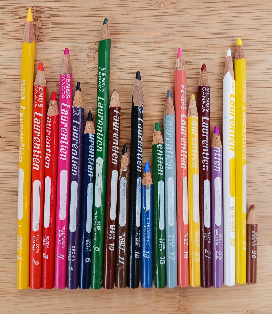
Yesterday was Canada Day so am sharing a bit of Canadiana – the classic Canadian school supply, Laurentiens coloured pencils (or pencil crayons as we call them around here). Although they are no longer made, their past popularity makes them an easy thrift store find.

I couldn’t find out when Laurentiens were first introduced by the Venus Pencil Company but it was probably in the early 1950s. By the 1960s, they were packaged in the familiar vinyl pouches. Originally called Laurentian, the spelling was changed to the French “Laurentien” in 1972, in an apparent attempt to increase sales in Quebec. A year later Faber-Castell bought Venus which was sold again in 1994, this time to Eberhard Faber. At some time after that, Laurentien pencil crayons began to be manufactured in the United States under the Sanford brand until they were discontinued in 2012.

The original Laurentian spelling indicates these four were made before 1972.

 All the pencils were numbered and given colour names – some puzzling to me like Sky Magenta, a light purple. I don’t remember anyone having sets of more than 36 pencils when I was a child in the 1970s (I only have 21 different ones now), but Wikipedia has a list of 72 colours so they must have added to them over the years. Some of the colour names changed giving a clue to their age but I didn’t discover exactly when this happened. For example, Sarasota Orange and Midnight Black are the older names and the bilingual labels are newer.

The formula may have changed over time as well. It seems as if the leads in the newer ones break more easily and one, Blush Pink, became lighter in both the barrel colour and the lead.

The white space on the shaft is to write your name on. Not a bad idea when everyone had the same ones but I don’t remember anyone in my class doing that.

If Laurentien coloured pencils were people, they would be a classroom of students happily colouring maps of the world.