Paper Marbling

I used both white and coloured papers and cardstock to experiment.

Last weekend I went to a really fun meet-up put on by the Edmonton Calligraphic Society where we made marbled papers with shaving cream and acrylic paint. If you love old books like I do, you may have seen marbled paper used as endpapers where they neatly cover and decorate the messy parts of bookbinding. The swirling designs were thought to look like marble, hence the name. These patterns are traditionally created by floating pigments and/or dyes on water that are then transferred to the paper. The water is often thickened with sizing so, as shaving cream is nearly 80 per cent water, it is not as far from the original technique as you might think.

No one knows exactly when paper marbling was invented but the process seems to have developed independently in both China and in the Middle East (Iran, Uzbekistan, and Afghanistan are all cited as early innovators of this technique). It came to Europe in the 17th century via travelers who brought back paper samples from the Middle East.

Thankfully we no longer have marbling guilds zealously guarding their techniques as they did in Europe, so Arlene Bowles was able to lead us through the steps to create the papers.

1. Fill a pan with shaving cream. If you are using standard sized paper, a rectangular pan (13 x 9 x 2” or 33 x 22.9 x 5 cm) will work.
3. Drop liquid acrylic paint onto the shaving cream. You can’t go wrong if you choose colours adjacent to each other on the colour wheel (in the picture green, blue, and purple are used) but one participant got stunning results using pink, black, and silver so experiment. Cheap paints work fine for this.
4. Swirl the colours around with a skewer or stir stick, minimizing blobs
5. Gently press a piece of paper or cardstock onto the top.
6. It doesn’t look like much when you pull the smeared mess out the pan.
7. The big reveal comes once you start to pull the squeegee down the paper.
8. The serendipity of the results is a big part of the fun and it doesn’t end there.
9. You can go back several times into the shaving cream, adding more paint or fresh shaving cream to get different results.

A side benefit for this activity is that your papers end up with a faint smell of shaving cream.

This was a great activity to do as a class because it is easier if you have extra space for drying but most of all from the inspiration that comes from seeing what other people come up with. Here are some of my creations:

Rather homely yellowed envelopes were transformed.
Cute boxes made out of marbled cardstock

If marbled papers were people, they would be maximalists when it comes to pattern and smell great.

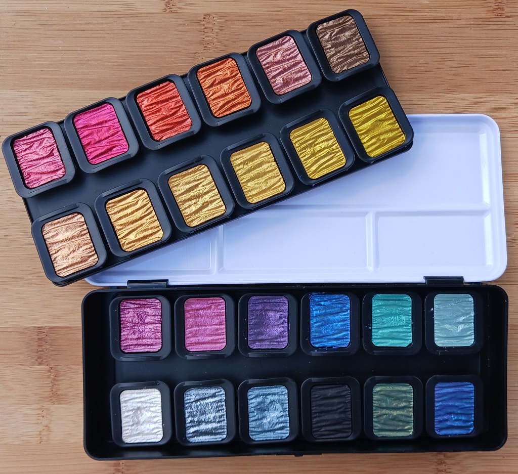
Finetec Pearlescent Watercolour Paints

July is World Watercolor Month so I am featuring my Finetec Pearlescent Watercolour Set. I wanted these German-made paints to do calligraphy, but they can be used in a more traditional way, like adding a little sparkle to a sunset, some iridescence to a dragonfly wing, or an accent in the centre of a flower.

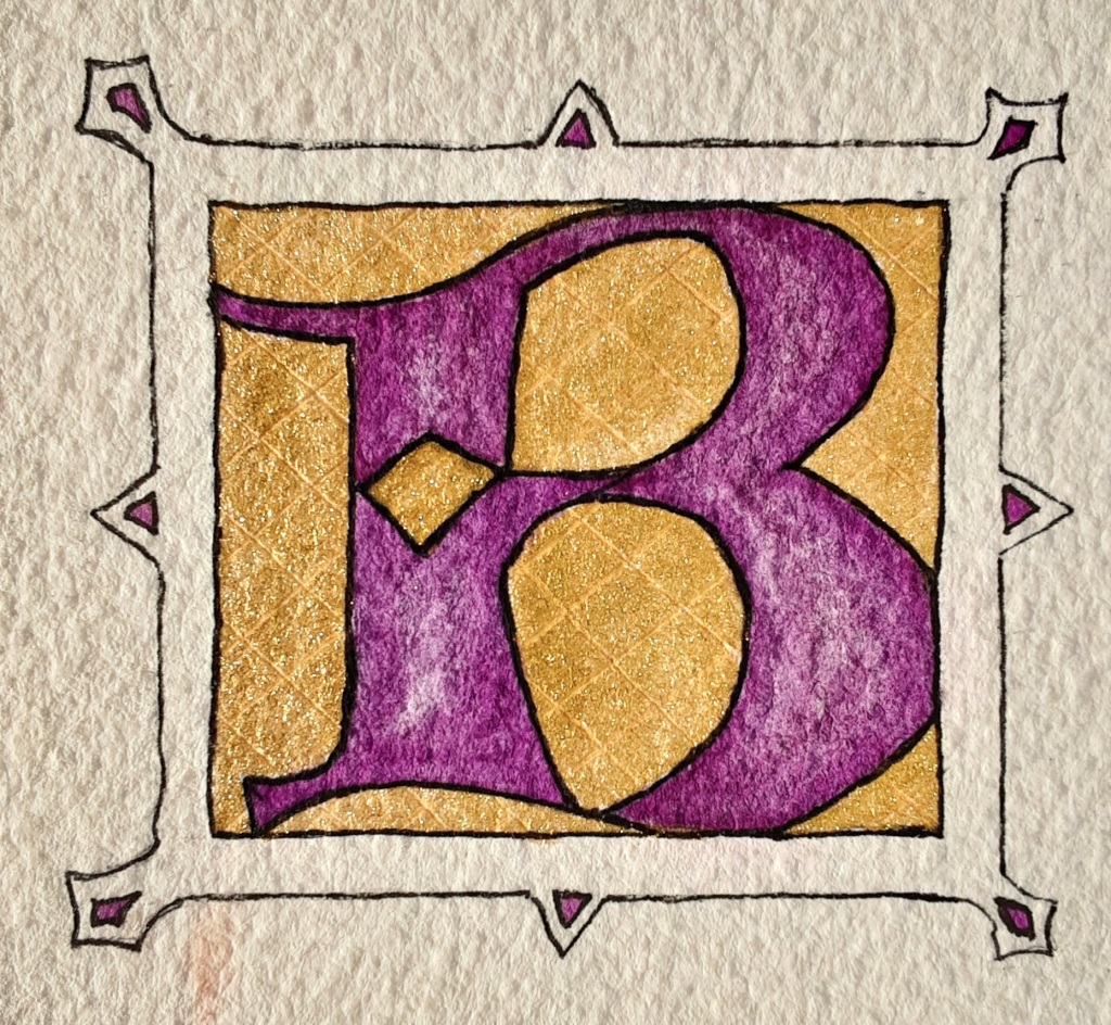
Medieval scribes would have used gold leaf on their illuminated letters but Finetec Arabic Gold 620 is a reasonable and more cost-effective alternative (done on Arches cold press 300 lb. watercolour paper and outlined with a Pigma micron pen)
For this envelope, I moistened the paint and brushed it onto a calligraphy nib
I did some test stripes in my Hahnemuhle sketchbook

Just opening the box is like peaking into a treasure chest with the sparkly rippled paints inside. The tin lid makes a good colour mixing palette and then there are two layers of individual pans inserted into plastic trays.

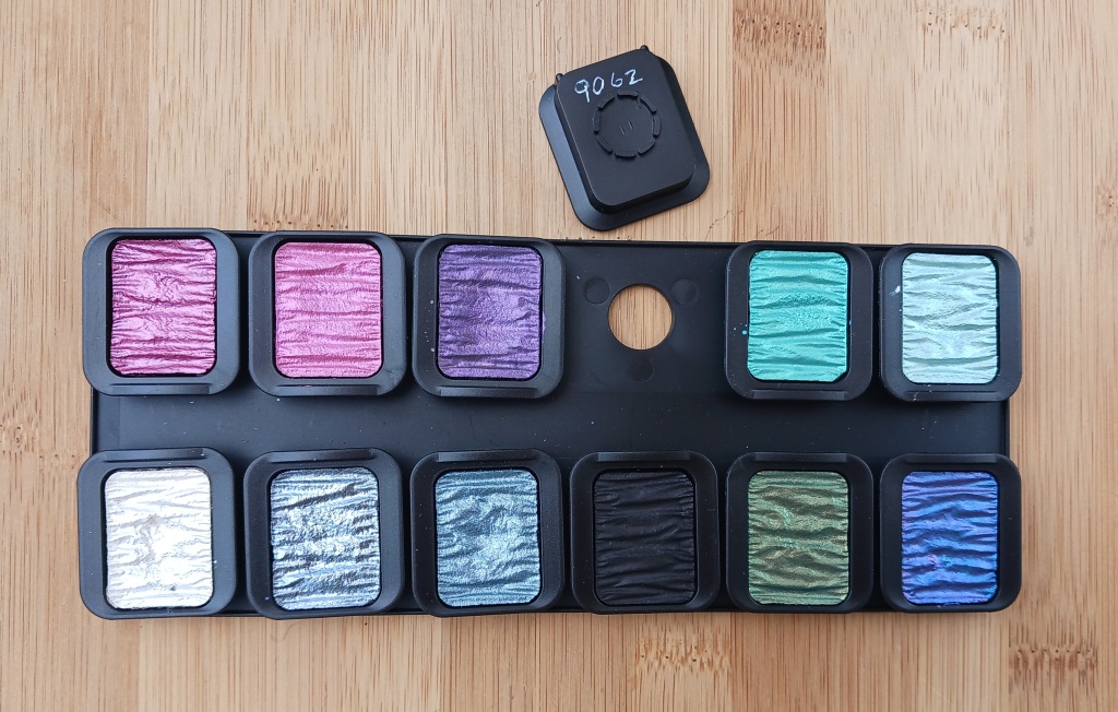
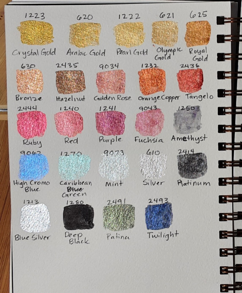
I wrote the colour number on the bottom of each colour using my white cat gel pen so I can remember which colour is which.

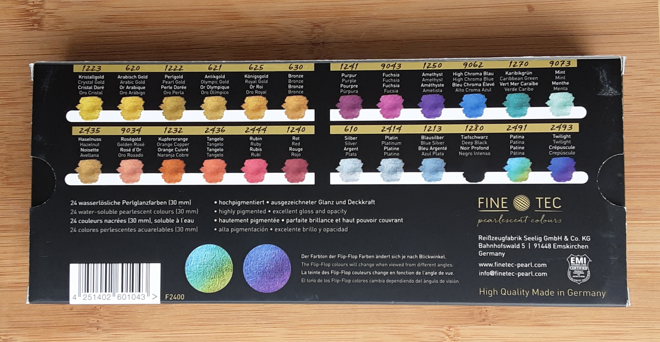
The individual pans pop out easily (a little too easily in my opinion). This makes it easy to replace just one colour if you run out or to reassemble the pans in some other way. The colour numbers are listed on the back of the cardboard box it came in.

I did test swatches on both black and white paper as the colours look quite different depending on the background. Except for the Deep Black, I think most of them look better on the darker background. It is hard to get a photo that captures how light affects the colours. In particular, Patina and Twilight magically change colour when viewed from different angles.

On Canson 140 lb cold press watercolour paper
Same page with less direct light
On black Canson Ingres paper

If Finetec Pearlescent Paints were people, they would have two sides to their personality. Always colourful, sometimes they absolutely sparkle.

Sakura Koi Water Colours Field Set

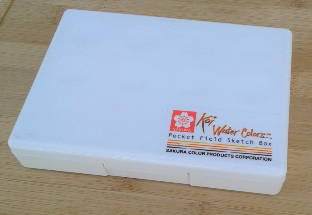
With all the social distancing going on due to the COVID-19 crisis, I have been doing a lot more art projects recently. One item I have been having a lot of fun with is my Sakura Koi Water Colours Field Set. Made by the Sakura Color Products Corporation of Osaka, Japan, this neat little set of high-end, student-quality paints has been my primary watercolours for over four years now. Sakura means cherry blossom in Japanese so it makes sense their logo is a stylized cherry blossom.

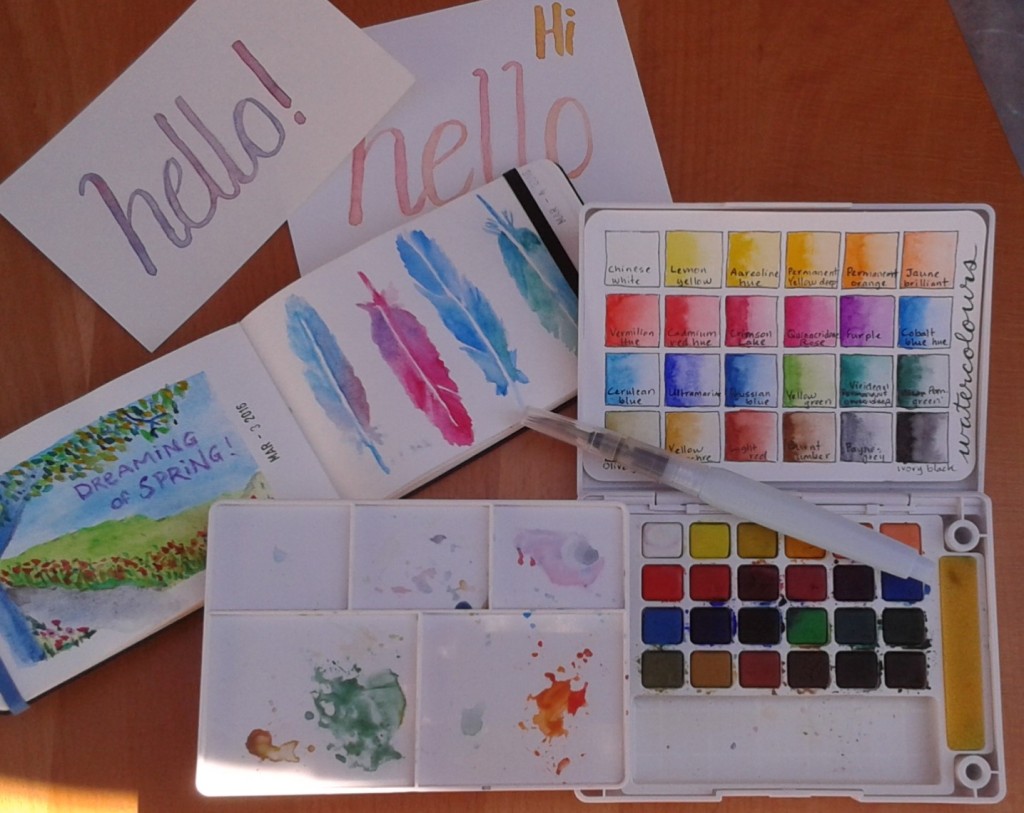
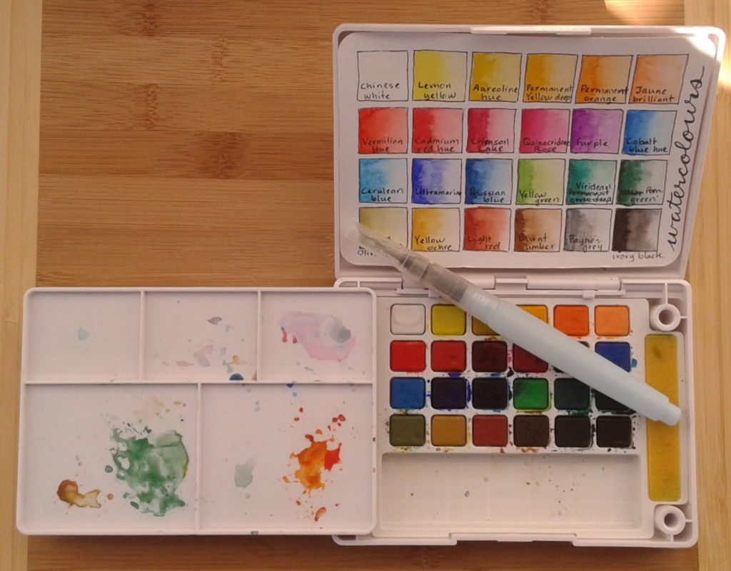
If you’ve been reading my blog over the years you have already seen many examples where I have used these paints. It’s designed to be portable so it’s usually part of my travelling stationery supplies. Sakura has other sets available but mine is the 24-colour size which measures approximately 15 x 11 x 2.5 cm (6.2 x 4.5 x 1.3 inches). I made a colour chart on a Hahnemuhle watercolor postcard that fits nicely inside the cover but you could also use the lid as a pallete or a little easel. The colours are very vibrant and I’ve found a little goes a long way.

Inside the box is a removable mixing pallete with little pegs that fit into holes in the corners of the paint set, which holds it in place when the box is closed. While painting, you can place it in two holes beside the paints making it adaptable for either right or left-handed painters. The sponges on either side of the paints are surprisingly useful to remove extra water from your brush and can be taken out and rinsed easily.

The set comes with a medium tip water brush. A water brush is a paint brush where the handle is actually a plastic reservoir for water. I like the idea but I haven’t really mastered the water brush. I’ve tried it for both painting and calligraphy but I’m never very happy with the results. Usually I just use a regular paint brush with this set. I’ve also never used the flip-down ring on the bottom of the box which is supposed to be handy if you are painting outside.

If this set was a person they would definitely be artistic. You can see them wearing a floppy hat while sitting on their portable folding stool doing urban sketching on a sunny day.

Yupo

Finished painting

Earlier this week I participated in a mini-workshop with local Edmonton artist Karen Bishop to create a watercolour landscape on Yupo. Yupo is a very smooth, white, synthetic “paper” made by extruding polypropylene pellets. Yup, no trees are harmed in the making of this product. It’s hard for me to decide whether this is good or bad environmentally. The manufacturers say it is recyclable but I imagine most consumers and recycling facilities would not realize it’s plastic, not paper, so it would probably end up as a contaminate in the paper stream. As a plastic it will never decompose. Good quality watercolour paper is made from 100 per cent cotton paper, traditionally made from recycled rags, so I think it would come out ahead in the sustainability evaluation.

Yupo comes in packages and sheets

Yupo’s smoothness makes it very interesting to play with as the watercolour paints interact with it very differently than with paper. We experimented on a small (10 cm²) sample piece just to get an idea of how the paint would move and react on the paper. Since none of the pigment gets absorbed by the paper, the colours are much more vibrant than traditional watercolour paper and you can actually wipe it off the Yupo. It’s very hard to control what happens so you really have to loosen up and let it flow as it will. Watercolour on Yupo is not for perfectionists. You have to accept serendipitous results so it is more amenable to creating abstract works than precision illustration.

Test sample

We began doing a simple sketch on the paper. Everyone in the workshop started off with the same idea of a large tree in the foreground with a lake and mountain in the background (except for a little boy who had come along with his mom and created, what appeared to be, space ships and dinosaurs). Despite the same theme, the end results were very different.

Most of the participants used a pencil to make the sketch but as you can’t erase on Yupo (erasers remove some of the smooth finish), I thought I may as well just go with pen. I used a very nice black Pitt artist pen with a fine brush tip made by Faber-Castell which the instructor provided.

Once the sketch was complete, we began adding colour with some Holbein watercolours. As is usual with watercolour painting, we started off light and added deeper colours later. About halfway through, we took a break to let some of it dry before continuing, otherwise the colours would continue to blend and flow on the Yupo.

Midway through the process, see final result at top of blog post

It was fun to experiment with Yupo but I’m much more comfortable with regular watercolour paper.

If Yupo was a person it would be very modern but a bit superficial. They love to wear bright colours and spend their money on the latest in new products.

If you would like to win some Yupo to try for yourself, please enter this World Watercolor Month contest before July 18, 2019: https://doodlewash.com/giveaways/legion-yupo-world-watercolor-month-2019-giveaway/?lucky=159112.