Decorated Christmas Envelopes

I spent at least as much time addressing and decorating envelopes this year as I did making cards. It would be much more efficient to pick a style and work with it but I love to experiment with different designs.

I had more fun experimenting with embossing powder on some light blue envelopes. I used the asterisk from a set of alphabet stamps to look like snowflakes and then embossed them. I realized I could also put embossing powder on wet ink so I want to experiment some more with that. The calligraphy was done with walnut ink using a Tachikawa G nib.

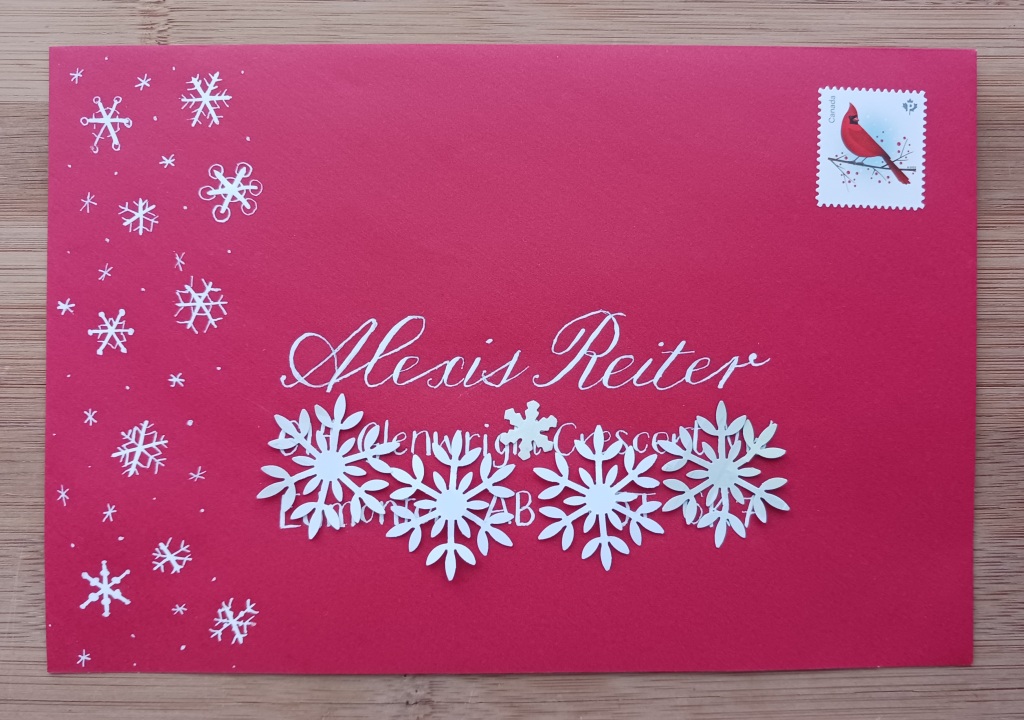
I used my white Uni-ball Signo Broad gel pen to draw banners and a modern versal on coloured envelopes.

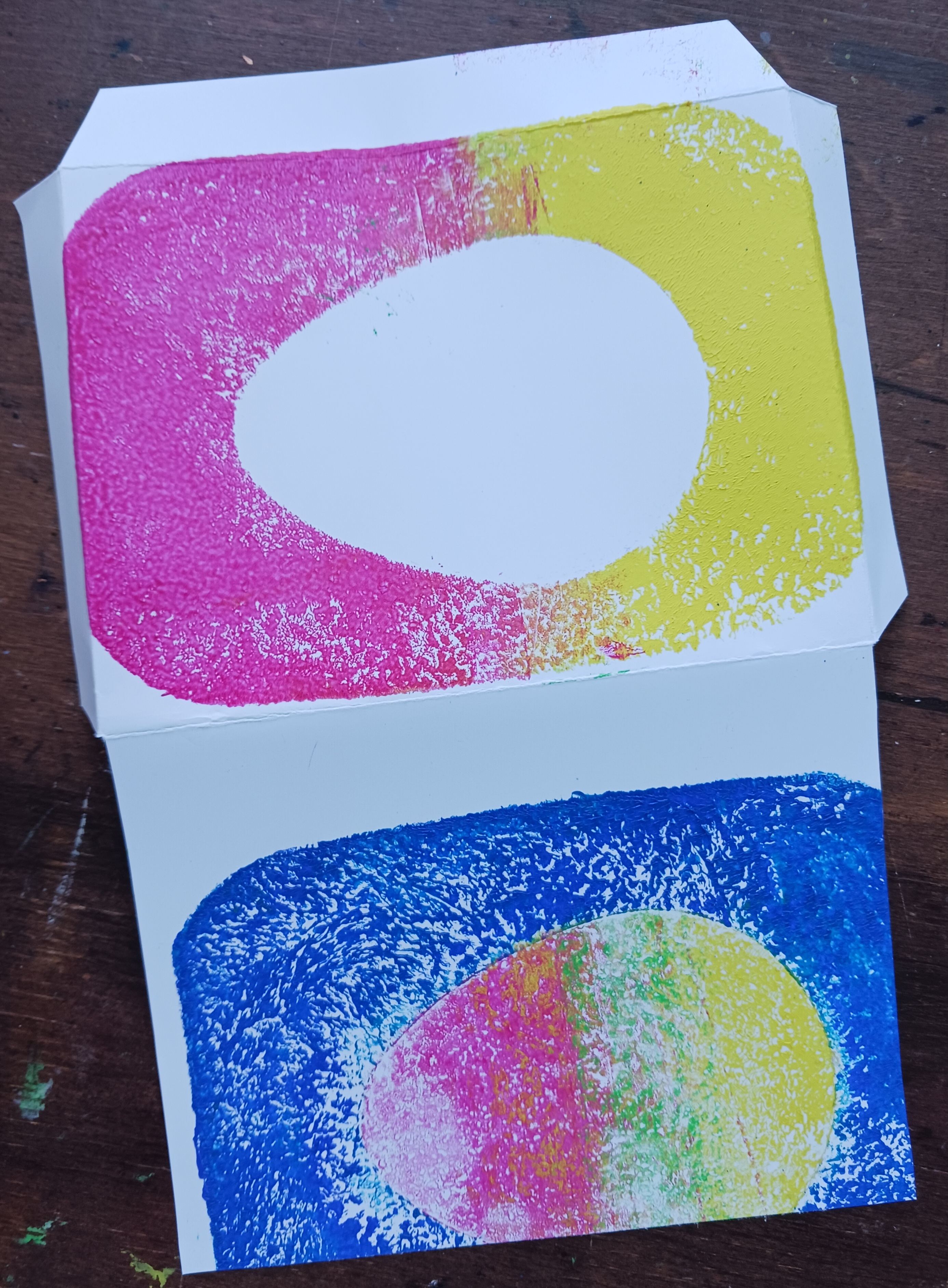
I had some envelopes I knew wouldn’t work for calligraphy so I had fun making a striped design. I have tried this in the past with a smaller envelope where I used a little tag as the mask and only wrote the name on it with the address written between the lines. I had more space on these ones so I put the whole address on the tag shape.  After making the first one, I put the stripes on a diagonal and added a thin green line with a Zebra Doodler’z glitter gel pen to give it more of a candy cane look. I used an old Mr. Sketch scented watercolor marker (“cherry”) with chisel tip. Mr. Sketch is a favourite of flipchart users and pre-schoolers. They last a long time (I’ve had mine for over 10 years) but you need to be careful because they do smear.

The Christmas decorations were inspired by one of the cards I shared in my last post. They are just painted with watercolour and addressed using a glitter gel pen. 

The tree on the green envelope was painted with Finetec watercolours and the lettering was done with my DecoColor Calligraphy paint marker. Unfortunately, the paint mark started to dry up (the metallic ones never seem to last long) so I highlighted the letters with a glitter gel pen.

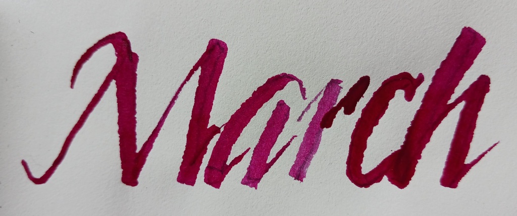
On this envelope I did Art Deco style lettering using my Jinhao 992 fountain pen loaded with Pelikan Edelstein Star Ruby ink (this ink is definitely on the pinker side of red).

The triangle tree with writing is a pretty simple concept. I drew it with a pencil and then went over it with Zebra Doodler’z glitter gel pens (I have used them a lot this year).

I found a wax seal with a holly design at the Edmonton ReUse Centre earlier this year so sealed some coloured envelopes with white wax. I never seem to be able to make perfect round seals. I coloured in the holly design with markers afterwards.

If these envelopes were people, they would be a group of carolers who may not always sing in harmony but their message is heartfelt – enjoy your holiday in way that brings you happiness!

Calligraphy based on a Happy Ever Crafter design.

Dr. Ph. Martin’s Bombay India Ink

Dr. Ph. Martin has a wide variety of products. In January I tried Dr. Ph. Martin’s Bleed Proof white ink and have been experimenting with another Dr. Ph. Martin’s product, this time it’s the Bombay India Ink. Traditionally the term India ink refers to a permanent, black, opaque ink made from soot like Schmincke India ink. I am not exactly sure what the pigment is in my Bombay India ink as it is a very bright red-violet colour so definitely not soot, but it does have shellac as part of its formula so that is how it fits into the India ink category. There are 23 other colours in this line. The label on the bottle says it is lightfast and waterproof. I haven’t tested the lightfast claim but it is waterproof when dry.

It comes in a glass bottle with a dropper-stopper lid. The opening of the bottle isn’t large enough to dip a pen into so I use the dropper to put the ink onto the nib.

I have only used it for calligraphy but I think it could be used for artwork as well. The transparent colour gradates from a brilliant red-violet to pink. I like using it on envelopes because, although it is an unusual colour, it is still very legible and the fact it is waterproof means you don’t have to worry if it gets damp. You do need to clean your nib promptly afterwards though, as once it is dry it is there to stay.

Here are some examples of where I have used this ink: 

Written in uncials with Speedball C-2 nib
Written with Tachikawa G nib on an envelope from my The Village Artisan recycled writing paper
Written with Tachikawa G nib in a Journalbooks notebook
Written with folded pen in vintage Peebles Press journal
Design from the Postman’s Knock, with black sumi ink on Wausau Professional Series Royal fiber paper

If Dr. Ph. Martin’s Bombay India Ink were a person, they would never have actually travelled to India but love the colourful fabrics of that country.

Happy Easter!

I love an excuse to play with my gelatin printing plate so I recently used it to make an Easter card.

Some acrylic paints work better on the gelatin plate than others. Through trial and error, I have found Pébéo Acrylics Studio High Viscosity paint work well. This paint is thick but easily spreadable with the brayer. Although the paints are now made in China, Pébéo is a French company established in 1919 in Provence, east of Marseille. At that time ready-to-use paints were not common, instead artists mixed up their own using pigments. The company got their name from the lead protoxide (PbO) they manufactured for use in paint production. It wasn’t until 1934 that acrylic paints were invented and it took a few years until they were widely used by artists.

I made a few versions of the of the same idea using an old promotional post-it note pad from the Egg Farmers of Alberta as a mask on the back of paper printed on one side. In retrospect, I wish I had added some white to the paints to create pastel colours. The end results were very bright.

Once I had my prints made, I chose my favourite and mounted it on Stampin’ Up paper I picked up at the Edmonton ReUse Centre. Last time I visited, there were a lot of scrapbooking supplies so I also got a sheet of “bunny hop” stickers from Doodlebug Design Inc. The stickers are dated 1984, so it’s amazing they still stick almost forty years later.

By using re-purposed paper and salvaged craft supplies, I can confidently say no bank accounts were harmed in the making of this card.

Before I added the stickers

I still had lots of printed paper left after choosing one for the card so I made an envelope to go with it.

If this card was a person, they would be thrifty, and have a more is more aesthetic, wearing very colourful clothes and too many accessories.

Dr. PH Martin’s Bleed Proof White Ink

Rabbit design from The Postman’s Knock

Today is Lunar New Year so Happy Year of the Rabbit!

I really wanted to try Dr. PH Martin’s Bleed Proof White ink since so many calligraphers recommend it. I was very happy to get a bottle for Christmas.

First off, I liked that it came in a simple glass jar with no extraneous packaging. It is very concentrated so it needs to be diluted before using as an ink. The consistency reminded me of Liquid Paper and I think it would actually work as a correction fluid as it is very opaque. One calligrapher recommended a dilution of one part water and one part Bleed Proof White so a small jar goes a long way. I found it difficult to get the consistency just right but I think that would come with experience. I have also heard of watercolour artists using it to add white highlights to a painting.

It is striking on black paper but note that it is not waterproof.

The odd name goes back to the original manufacturer, B. Aronstein & Co. of Flushing, New York in 1934. At that time putting the word “doctor” in front of something gave it an aura of respectability. I wonder how many shoe fans have looked up docmartins.com and discovered ink? Ben Salis started working for the company in 1936 and eventually became the owner. It has been a family business ever since.

If Dr. Ph. Martin’s Bleed Proof White ink were a person, they would be a bit thick despite their alleged PhD.