Button Lettering

Written with a Bic Cristal pen on Greys paper

The Edmonton Calligraphic Society is doing a mix of in-person and zoom classes this year. November’s class was done through zoom on Button Lettering with Violet Symthe. She taught us Neuland last year and is a very good teacher as well as an excellent calligrapher.

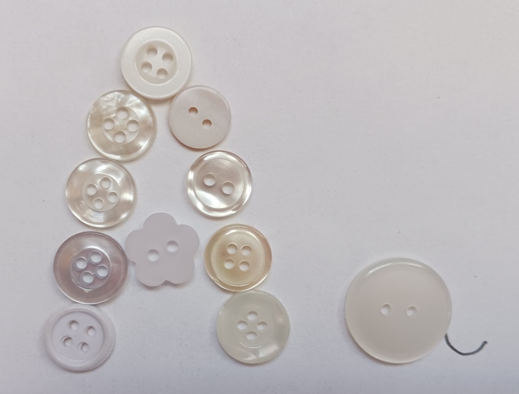
When I first saw the list of classes for this year, I imagined Button Lettering to look something like this:

Fun fact: Since 1938, November 16th has been National Button Day in the USA.

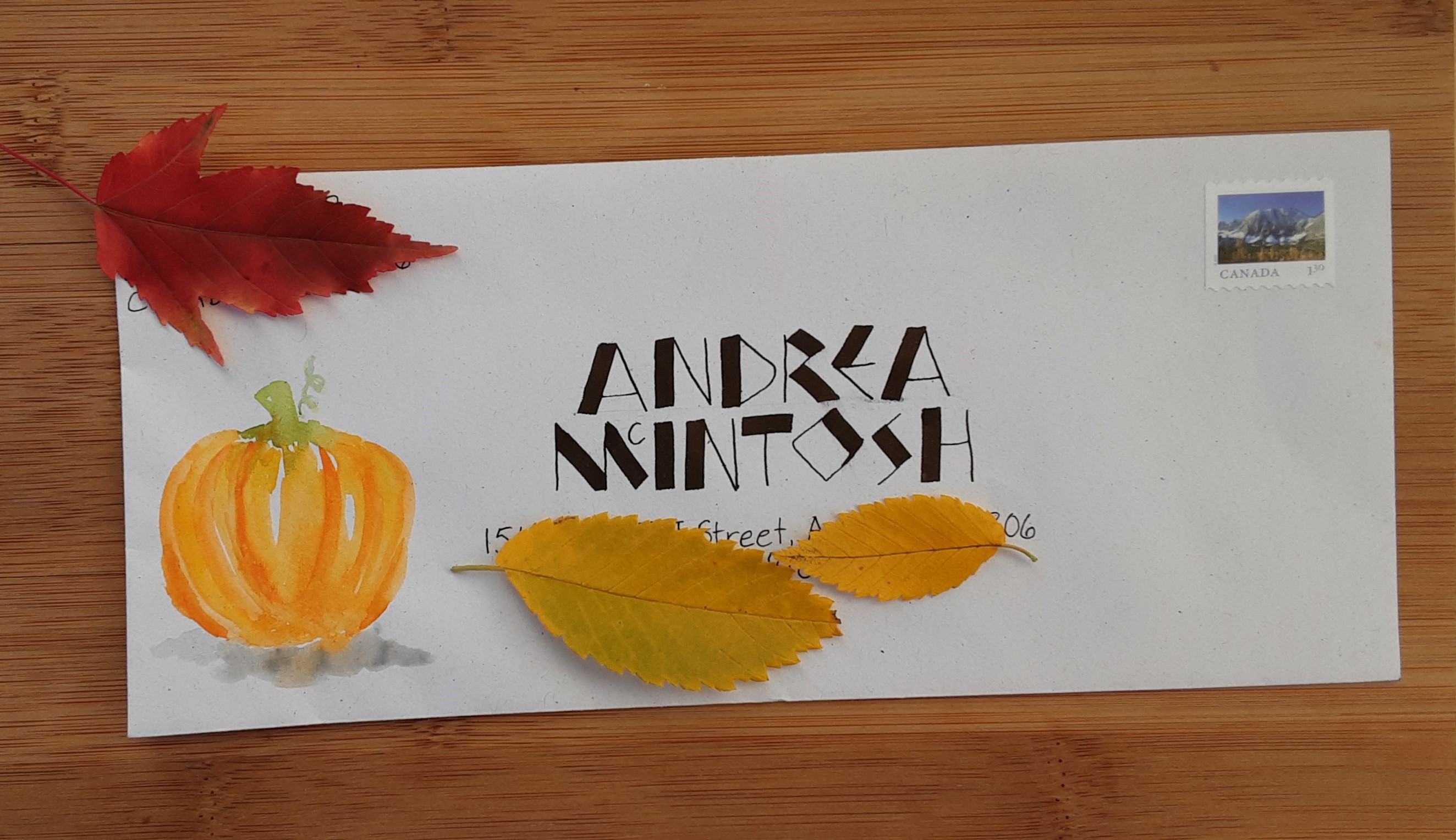
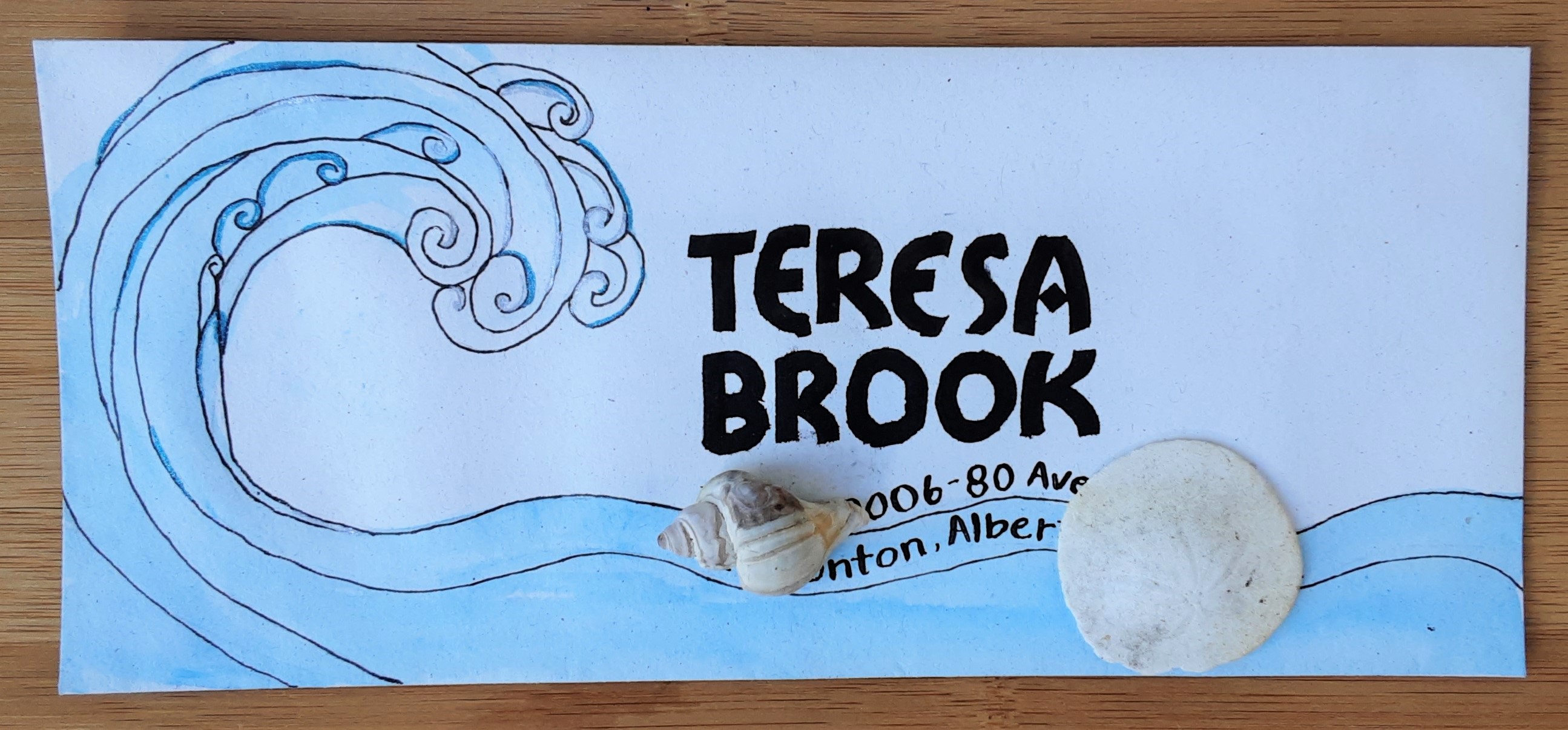
In reality, this lettering style was given the button name by calligrapher Peter Thornton as he created it for name buttons for a calligraphy conference. It seems an unusual choice for this purpose as I don’t find it particularly legible but it does have a playful energy. 

It is a fun lowercase lettering style that is perfect for broad-edged calligraphy tools like the Pilot Parallel pen or chisel-edged markers. However, there are not a lot of rules in this style and it can be adapted to a variety of writing instrument. Violet suggested going bigger is better with these letters and I agree. She loves to use a 6.0mmparallel pen but I only have a 3.8 mm one. It was really tricky trying to use the 2.5 mm Sanford calligraphic marker to write the alphabet, but that was partly because my marker is old and doesn’t have a sharp edge anymore. I tried button lettering using a variety of supplies.

If Button Lettering was a person they would be goofy and energetic. Sometimes they get so excited it’s hard to understand what they are saying.

Ben Shahn Lettering

Back in April, the Edmonton Calligraphic Society invited Cora Pearl of Portland, Oregon to teach Ben Shahn lettering at their monthly zoom class. She was a very good teacher probably because she teaches at a community college as well as at calligraphy conferences and her own classes. I liked how she broke everything down into logical steps. She started doing calligraphy at age eleven and since then has completed a BA in art and art history. Although her teacher, Sheila Waters, hated this style of lettering, she loves how it breaks rules in that it is not mathematical or even regular. The letters are all the same height except when they are not, there is a mix of chunky and curved lines, and he loved ligatures where two letters are joined together.

Cora didn’t know what tool he used for his work but we used a Pilot Parallel pen in the class. Ben Shahn didn’t have a single way of creating his letters so this is my interpretation of Cora Pearl’s take on his alphabet.

Ben Shahn (1898-1968) was an American painter, printmaker and photographer, as well as an inventor of letterforms. He was born in Lithuania and his experiences as a poor immigrant led him to left-wing politics. Although he started out apprenticing as a lithographer, he pursued art training and was drawn to social realism and later, photography. His painting and photography definitely tended to be about serious subjects but his lettering style is whimsical. I like the playful look but as I usually use calligraphy for letters and cards, I haven’t found this style is particularly useful for the projects I do.

Recently I have been volunteering for our local Shakespeare in the Park festival. I have been attending this festival for many years and always find there is at least one quote from every play where I say to myself, so that’s where that came from. Here are some examples from the two plays the Freewill Players are performing this summer:

  • Measure by Measure: “What’s mine is yours and what is yours is mine.” (Duke, Act 5 Scene 1)
  • Midsummer Night’s Dream: “The course of true love never did run smooth.” (Lysander, Act 1 Scene 1)

I tried Ben Shahn lettering on a quote from The Merchant of Venice. While some aspects of that play are problematic, I think Ben Shahn would have liked the spirit of this quote.

Written with a folded pen using walnut ink on Eaton paper

If Ben Shahn lettering were a person, they would be aware of life’s injustices but still know how to have fun in a playful and unique way.

Uncials

Last month I went to an Edmonton Calligraphic Society mentor meet-up to learn about uncials. Uncial is an early hand that came about as writing evolved from Roman capitals chiseled into stone to writing with a broad edged nib on parchment. You can still see this style anytime someone wants to give a Celtic look to their words because it is associated with early Christian monks who went to Scotland and Ireland in the 4th and 5th centuries. Uncials continued to be used until the 8th century when more compact scripts, like Carolingian, came into use but it can still be seen in copies of the Bible until the 10th century. As with any very old hand that spans over hundreds of years, different languages (Greek, Latin, Gothic, and Coptic) and a variety of places (all over Europe and into Africa), there are lots of variations to this style but some characteristic features are that the letters are generally rounded, upright and spaced closely together. Uncials are written entirely as capital letters (majuscules) but they start the progression to lower case (minuscule) letters as some have small ascenders and descenders. I like the rounded look of these letters but some, like the D, look a bit awkward to me.

I did some experimenting with different tools and letterforms.

Although uncials are meant to be written with a broad-edged pen, I tried some based on Mike Kecseg’s uncial-inspired alphabet using a pointed pen.

I used uncials in some cards and in my journal.

If uncials were people, they would be short and stout. Although they are well-traveled folks, their distinctive look means you can pick them out anywhere.

Carrioka

The December Edmonton Calligraphic Society’s zoom class was with Carrie Imai from Los Angeles, California who introduced us to her own playful hand, Carrioka. At first glance, the broad strokes and chunky letters reminded me of Neuland but while Neuland is completely capitals, Carrioka is all lowercase. There are lots of other differences too; Carrioka is curvy and whimsical to Neuland’s straight, solid lines.

Carrie mainly demonstrated Carroika with a Pilot Parallel pen but personally loves using an automatic pen (something I haven’t tried). She suggested that larger flat nibs work better for these letters, like a Speedball C-0 or C-1 (C-2 at the smallest) or a Brause 2.

The trick to creating Carrioka’s curves is in the pen manipulation. You need to twist the pen by holding it lightly with your fingertips in a relaxed way (the middle finger and thumb do all the work), a challenge for a tight gripper like me. The nib is kept flat against the paper and small rotations of pen change the angle. The letters are placed closely together and, as Carrie puts it, should dance across the page.

Carrie came across as a very warm and joyful person. She referred to the smaller strokes as hugging the bigger ones and encouraged us to put emotion into the letterforms.

As well as the basic alphabet, Carrie showed us a variation which I actually like better.

I had some fun playing around with this alphabet.

If Carrioka was a person, they would be the goofy little sister of Neuland. Short, squat, and cute, she doesn’t take life too seriously.

Neuland

Tomorrow is Thanksgiving Day in Canada and I’ll be spending it with family in beautiful Montreal. I was inspired to make this card after last month’s class zoom class with the Edmonton Calligraphic Society where Violet Smythe introduced us to Neuland.

Neuland is a fun, chunky hand created by German calligrapher Rudolf Koch (1876 – 1934) almost a hundred years ago. Like Hans-Joachim Burgert, Koch had many creative interests beyond calligraphy including illustration, type design, and book binding. In fact, it was his interest in type design that inspired Neuland. At the time, many type designs were based on calligraphy and Koch himself loved Fraktur. However, in the case of Neuland, the inspiration went the other way. It is an example of a calligraphic hand inspired by his typeface. He made no preliminary drawings, instead carved the punches directly.

Koch’s original alphabet

Neuland is only done in capital letters and its simplicity lends it to creative exploration. I tried it on a few envelopes using a Pilot Parallel Pen and in a notebook using my folded pen. I didn’t completely stick to Koch’s original alphabet, instead tried variations like putting some of the crossbars in the letters on an angle and alternating thick and thin lines.

If Neuland was a person, they would be stout but not chubby with a rather poor sense of personal space. They boldly state that their favourite movie is Jurassic Park.