Ben Shahn Lettering

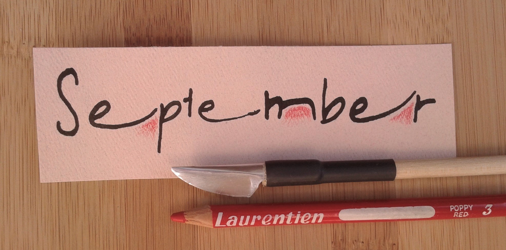
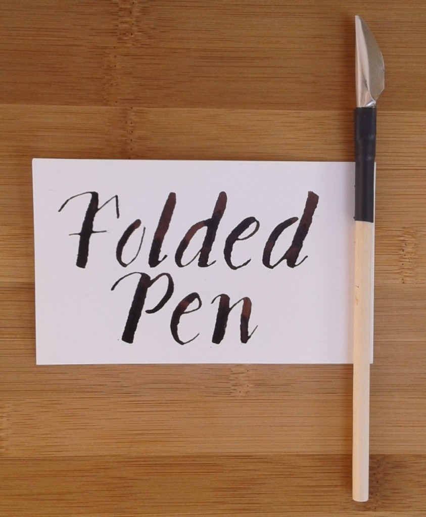
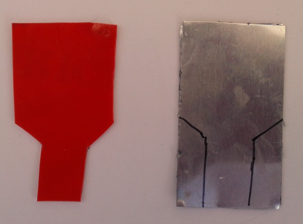
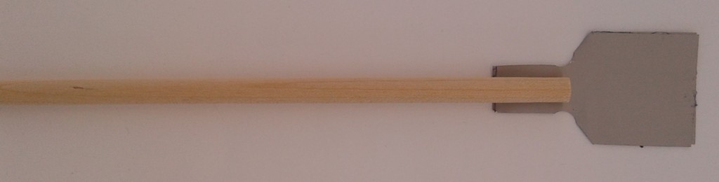
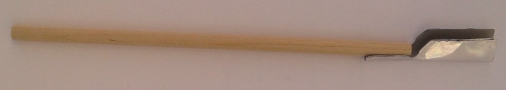
Back in April, the Edmonton Calligraphic Society invited Cora Pearl of Portland, Oregon to teach Ben Shahn lettering at their monthly zoom class. She was a very good teacher probably because she teaches at a community college as well as at calligraphy conferences and her own classes. I liked how she broke everything down into logical steps. She started doing calligraphy at age eleven and since then has completed a BA in art and art history. Although her teacher, Sheila Waters, hated this style of lettering, she loves how it breaks rules in that it is not mathematical or even regular. The letters are all the same height except when they are not, there is a mix of chunky and curved lines, and he loved ligatures where two letters are joined together.

Cora didn’t know what tool he used for his work but we used a Pilot Parallel pen in the class. Ben Shahn didn’t have a single way of creating his letters so this is my interpretation of Cora Pearl’s take on his alphabet.

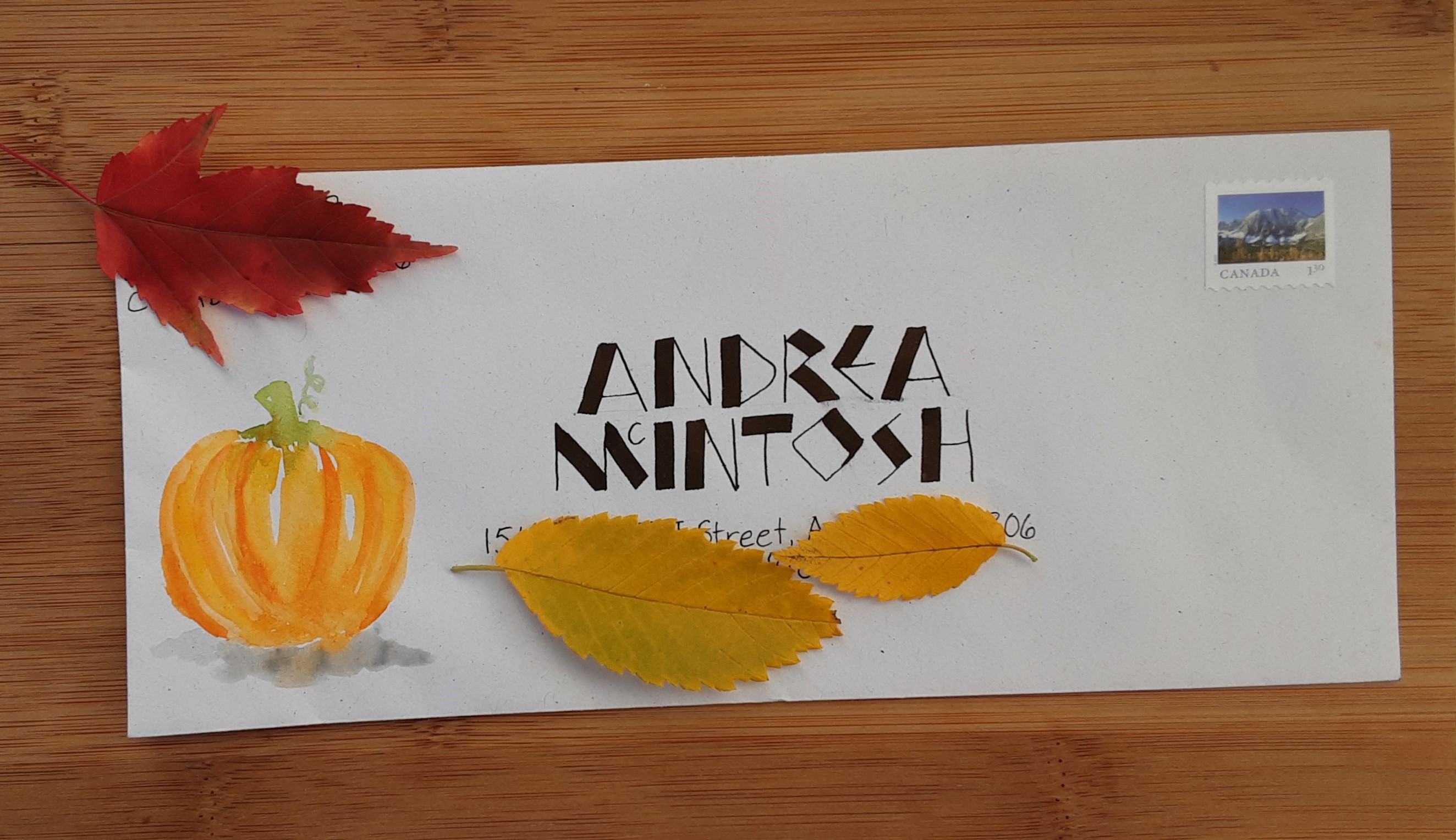
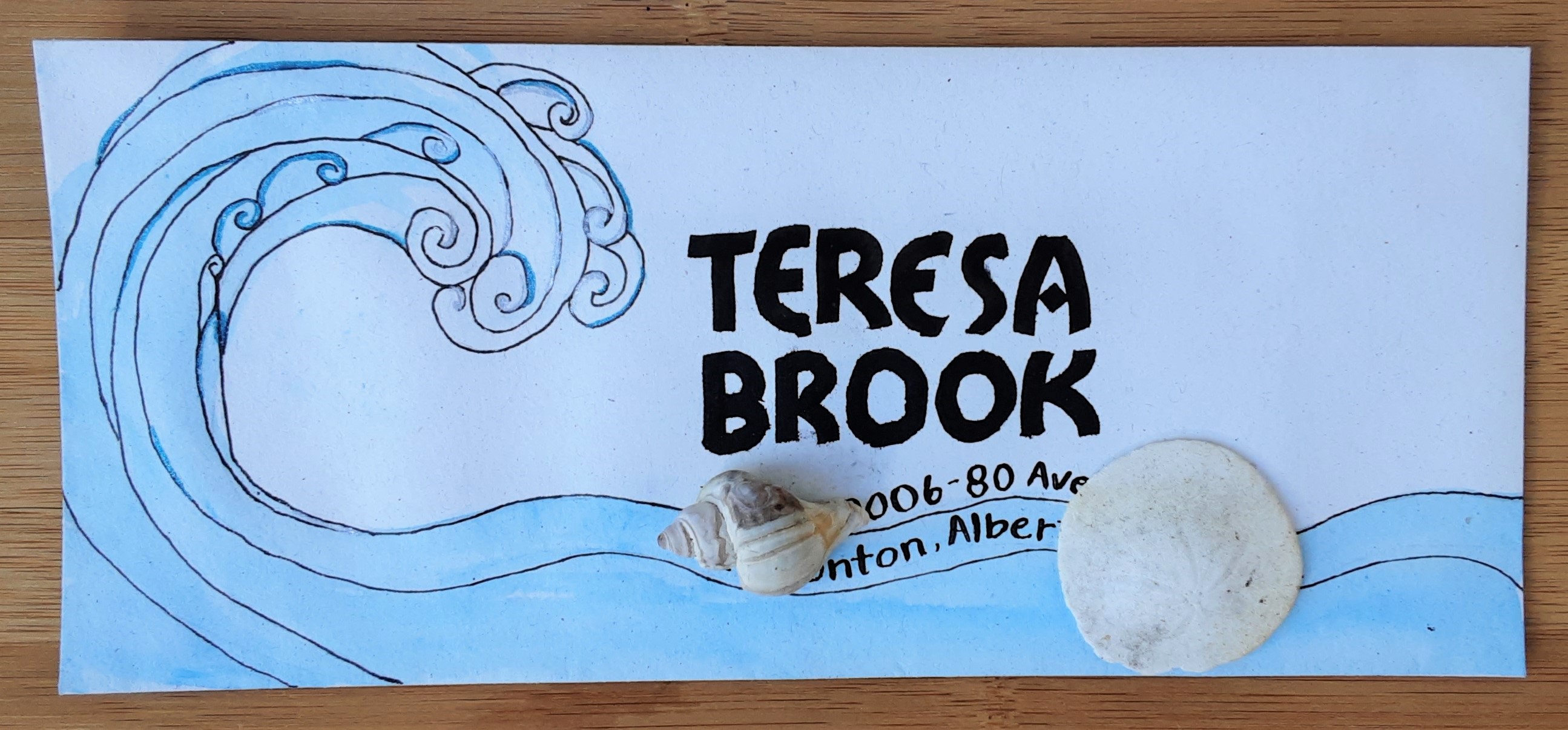
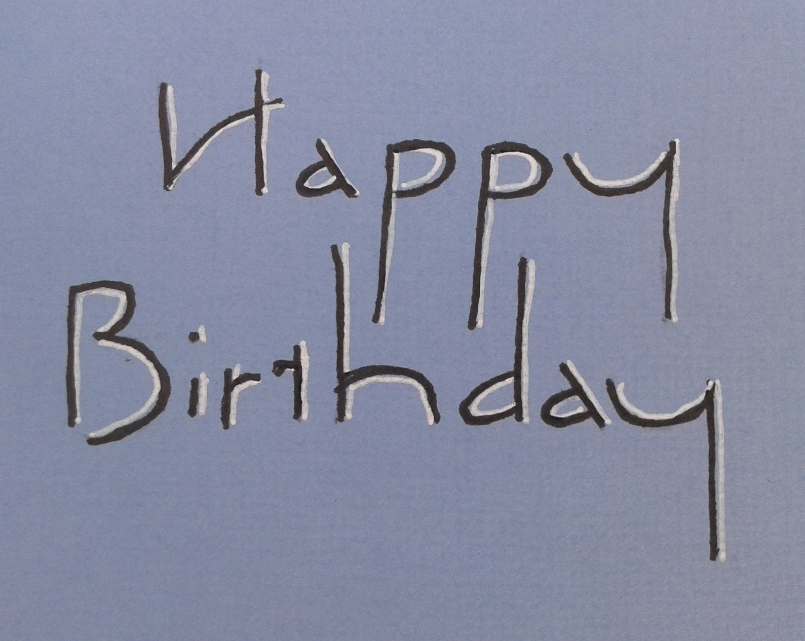
Ben Shahn (1898-1968) was an American painter, printmaker and photographer, as well as an inventor of letterforms. He was born in Lithuania and his experiences as a poor immigrant led him to left-wing politics. Although he started out apprenticing as a lithographer, he pursued art training and was drawn to social realism and later, photography. His painting and photography definitely tended to be about serious subjects but his lettering style is whimsical. I like the playful look but as I usually use calligraphy for letters and cards, I haven’t found this style is particularly useful for the projects I do.

Recently I have been volunteering for our local Shakespeare in the Park festival. I have been attending this festival for many years and always find there is at least one quote from every play where I say to myself, so that’s where that came from. Here are some examples from the two plays the Freewill Players are performing this summer:

  • Measure by Measure: “What’s mine is yours and what is yours is mine.” (Duke, Act 5 Scene 1)
  • Midsummer Night’s Dream: “The course of true love never did run smooth.” (Lysander, Act 1 Scene 1)

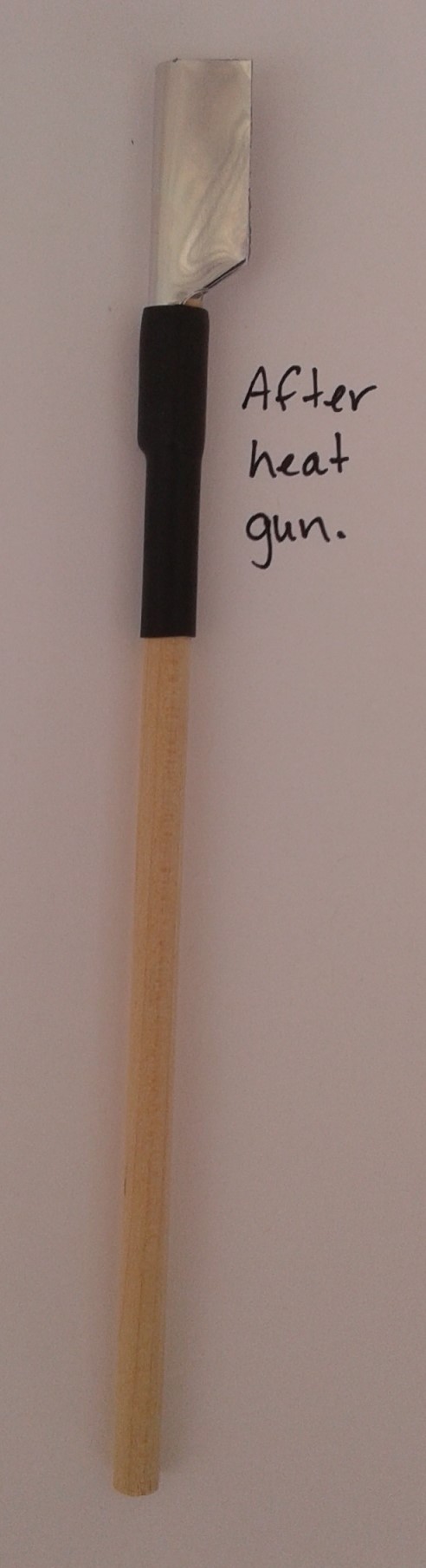
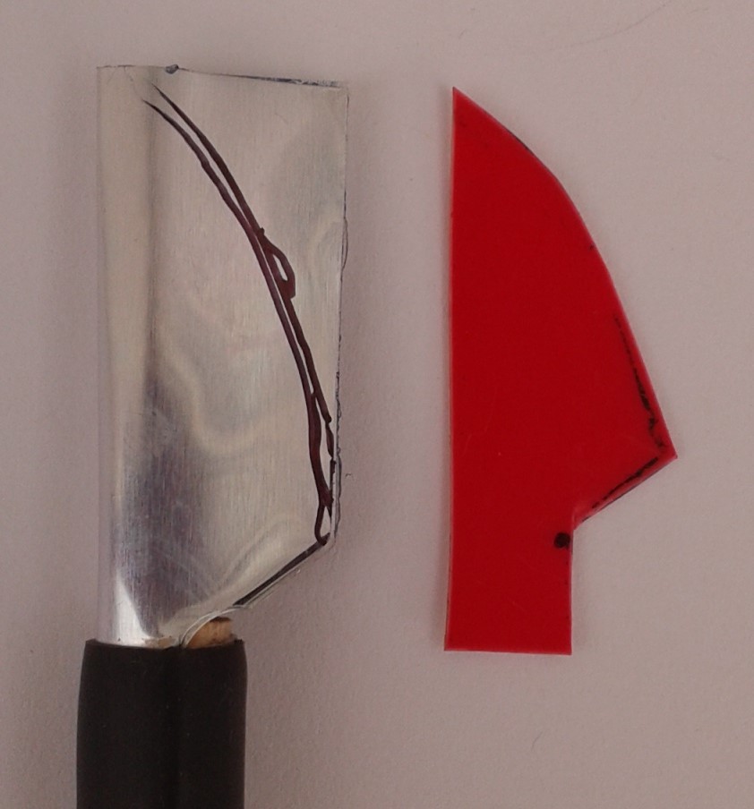
I tried Ben Shahn lettering on a quote from The Merchant of Venice. While some aspects of that play are problematic, I think Ben Shahn would have liked the spirit of this quote.

Written with a folded pen using walnut ink on Eaton paper

If Ben Shahn lettering were a person, they would be aware of life’s injustices but still know how to have fun in a playful and unique way.

Neuland

Tomorrow is Thanksgiving Day in Canada and I’ll be spending it with family in beautiful Montreal. I was inspired to make this card after last month’s class zoom class with the Edmonton Calligraphic Society where Violet Smythe introduced us to Neuland.

Neuland is a fun, chunky hand created by German calligrapher Rudolf Koch (1876 – 1934) almost a hundred years ago. Like Hans-Joachim Burgert, Koch had many creative interests beyond calligraphy including illustration, type design, and book binding. In fact, it was his interest in type design that inspired Neuland. At the time, many type designs were based on calligraphy and Koch himself loved Fraktur. However, in the case of Neuland, the inspiration went the other way. It is an example of a calligraphic hand inspired by his typeface. He made no preliminary drawings, instead carved the punches directly.

Koch’s original alphabet

Neuland is only done in capital letters and its simplicity lends it to creative exploration. I tried it on a few envelopes using a Pilot Parallel Pen and in a notebook using my folded pen. I didn’t completely stick to Koch’s original alphabet, instead tried variations like putting some of the crossbars in the letters on an angle and alternating thick and thin lines.

If Neuland was a person, they would be stout but not chubby with a rather poor sense of personal space. They boldly state that their favourite movie is Jurassic Park.

Akim

In September, the Edmonton Calligraphic Society hosted a Zoom meeting with calligrapher Julie Wildman from Indiana, USA to teach variations on Akim. Akim is a rhythmic, linear script created by the late German calligrapher, sculptor and musician, Hans-Joachim Burgert. The name Akim is a diminutive of his own name, Joachim. The letters are stretched and compressed in a fluid way. Burgert likened it both to the rhythm of a heartbeat and to the flow of waves.

Any kind of pen can be used to write Akim (I tried a fineliner and a pointed pen) but I liked using my folded pen best. I have some examples below. The Happy Birthday is one of my earlier attempts and, as a I practiced, I tried to loosen up a bit to get more of the expressive feel of this hand.

Julie has developed her own interpretation of Akim that she teaches online (and in-person in non-pandemical times). She is an excellent teacher, as well as calligrapher, and did a great job of using the online format. I’ve only just started to experiment with this hand and really don’t do it justice but would like to take another class from Julie some day and highly recommend her as a teacher to anyone who wants to learn more about Akim.  

If Akim were a person, they would be a musician, sometimes playing familiar tunes and other times improvising to an almost unrecognizable degree.

Folded Pen

At the September meeting of the Edmonton Calligraphic Society we made folded pens. A folded pen is basically a folded metal nib attached to a straight penholder. They were first introduced at a Letterforum conference by Matthew Coffin in 1995. The simplicity of the folded pen and its ability to make lovely thick and thin lines have made them popular with calligraphers ever since. While you can purchase ready made folded pens, it is fun and not too difficult to make your own. If you want to learn more about folded pens, I recommend you read Folded Pen Adventures by Carol DuBosch. The following steps on how to make one are based on her instructions.

Step 1. Cut a 1” by 1¾” rectangle out of a flexible metal like brass. Pop cans used to be popular for this purpose but apparently they are currently made out of metal that is too thin to make a sturdy nib. Mine was made out of two thin sheets of printing plate glued together. Using the pattern from Folded Pen Adventures, trace the pattern onto the metal (an ultrafine Sharpie works well for this). You can see that my pattern is a little bit wonky but it doesn’t matter.

Step 2. Before cutting it out, punch two holes with a standard ¼” hole punch in the inside corners as rounded corners are less likely to tear.

Step 3. Finish cutting out the shape using sharp scissors.

Step 4. Put the handle on the narrow part of the cut metal piece. (My handle is a ¼” dowel but it could be a pencil or some other stick).

Step 5. Gently fold the whole piece around the dowel.  

Step 6. Attach firmly with duct tape.

Step 7. The duct tape is enough to hold it but if you want the pen to look and feel better, cover with a piece of heat shrink tubing and attach over the duct tape with a heat gun.

Step 8. Gently shape the pen by pinching and smoothing the fold from the handle (where it is wider) to the top.

Step 9. Using the blade pattern from Folded Pen Adventures, trace the curve onto the metal aligning it near the handle.

Step 10. Beginning at the tip, cut along curve with a continuous smooth cut.

Step 11. Lay the pen down with the fold supported. Place an embossing stylus inside the spine and “draw” through the length at the fold from the handle to the tip. I don’t have an embossing stylus so I used the sharp end of a letter opener but I’m not sure this step is essential.

Step 12. Use sharp scissors to cut off just a tiny part of the tip so it is not quite so pointy.

Step 13. Smooth rough edges with 600 grit sandpaper. This gives the pen a nicer feel and helps the ink to spread out on the pen instead of beading up.

Step. 14. Dip into ink and have fun! Where you hold the pen, angle, and speed all make a difference in the type of line a folded pen makes so experiment with what works best for you.

If a folded pen were a person, they would be a do-it-yourselfer with a flair for the dramatic.