Green

Uncials written with  J. Herbin Lierre Sauvage ink using a Myers & Sons #2 nib

St. Patrick’s Day has become linked with the colour green although early depictions show him wearing blue and there is even a shade called St. Patrick’s blue. Green only became associated with Ireland in the late 18th century when Irish nationalists began to adopt green and St. Patrick’s shamrock as symbols of identity. Using colour in an emblematic way is not unique to the Irish. Colour has long held symbolic meaning to people.

Despite group affiliations with colour, we have no way of understanding how other people perceive it. Even something as straight forward as identifying the colours of a rainbow has been open to interpretation. In his 1664 book, Experiments and Considerations Touching Colours, Robert Boyle described the spectrum produced by a prism as “denoting the five consecutions of colours Red, Yellow, Green, Blew, and Purple”. Around the same time, Isaac Newton was also experimenting with prisms but he added orange and divided purple into indigo and violet to make seven colours, because the number had mystical significance to him. There are seven notes on the western musical scale, seven days of the week, and at the time, only seven planets had been discovered. As one colour blends into the next, it does seem arbitrary to try to divide them. When does yellow become green or green become blue?

The human eye sees green better than any other colour and we have a lot of ways of describing it. For example, Prismacolor Premier Soft Core Art Pencils come in at least 22 shades of green and they have another 7 in their Scholar line. Once you start blending colours you have even more.

Shown here are Prismacolor 989 Chartreuse, 910 True Green, 912 Apple Green, 913 Spring Green, 1005 Limepeel, 1006 Parrot Green, 1096 Kelly Green, and 439 Neon Green.

So, what does green mean to you – envy, sickness, nature, renewal, environmentalism? There is every shade of nuance to the world’s second favourite colour.

Laurentien Pencil Crayons

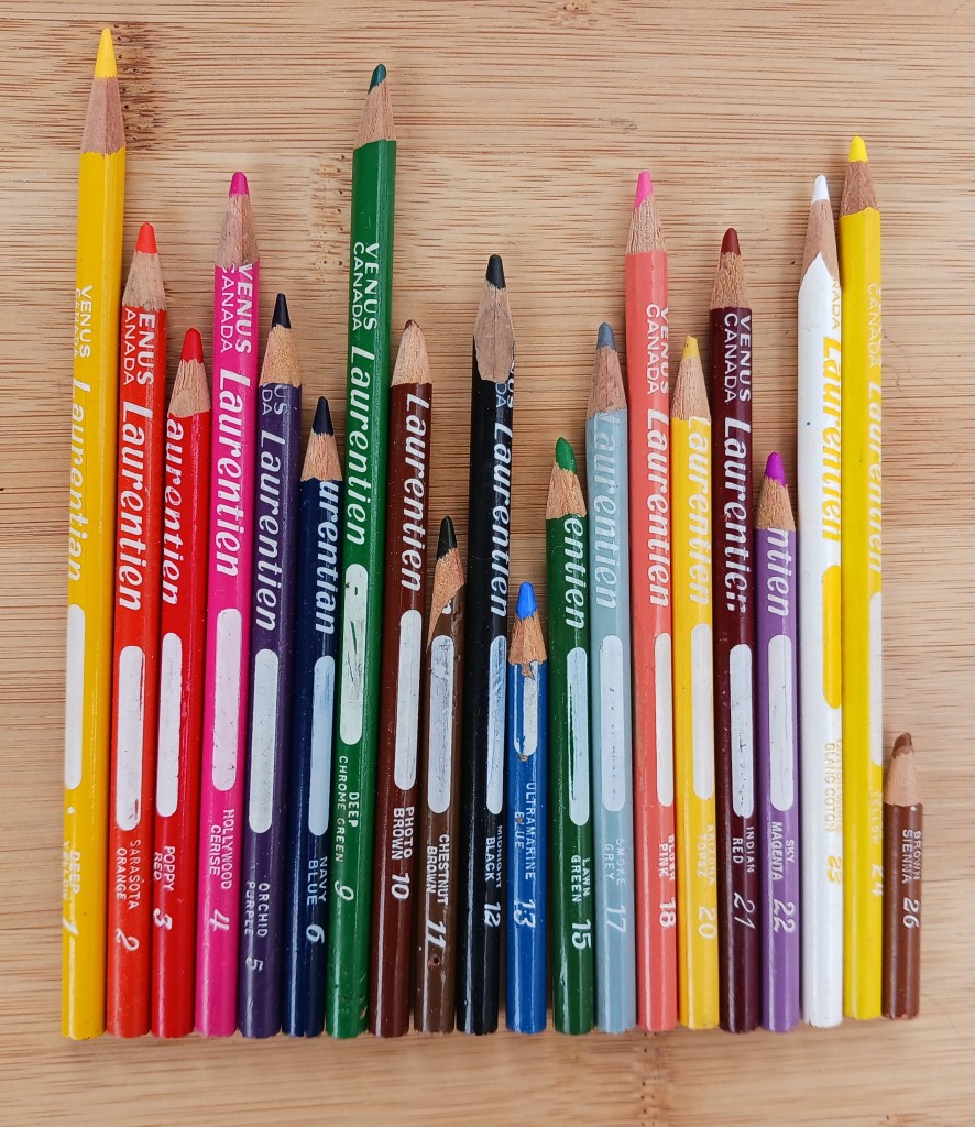
Yesterday was Canada Day so am sharing a bit of Canadiana – the classic Canadian school supply, Laurentiens coloured pencils (or pencil crayons as we call them around here). Although they are no longer made, their past popularity makes them an easy thrift store find.

I couldn’t find out when Laurentiens were first introduced by the Venus Pencil Company but it was probably in the early 1950s. By the 1960s, they were packaged in the familiar vinyl pouches. Originally called Laurentian, the spelling was changed to the French “Laurentien” in 1972, in an apparent attempt to increase sales in Quebec. A year later Faber-Castell bought Venus which was sold again in 1994, this time to Eberhard Faber. At some time after that, Laurentien pencil crayons began to be manufactured in the United States under the Sanford brand until they were discontinued in 2012.

The original Laurentian spelling indicates these four were made before 1972.

 All the pencils were numbered and given colour names – some puzzling to me like Sky Magenta, a light purple. I don’t remember anyone having sets of more than 36 pencils when I was a child in the 1970s (I only have 21 different ones now), but Wikipedia has a list of 72 colours so they must have added to them over the years. Some of the colour names changed giving a clue to their age but I didn’t discover exactly when this happened. For example, Sarasota Orange and Midnight Black are the older names and the bilingual labels are newer.

The formula may have changed over time as well. It seems as if the leads in the newer ones break more easily and one, Blush Pink, became lighter in both the barrel colour and the lead.

The white space on the shaft is to write your name on. Not a bad idea when everyone had the same ones but I don’t remember anyone in my class doing that.

If Laurentien coloured pencils were people, they would be a classroom of students happily colouring maps of the world.

Button Lettering

Written with a Bic Cristal pen on Greys paper

The Edmonton Calligraphic Society is doing a mix of in-person and zoom classes this year. November’s class was done through zoom on Button Lettering with Violet Symthe. She taught us Neuland last year and is a very good teacher as well as an excellent calligrapher.

When I first saw the list of classes for this year, I imagined Button Lettering to look something like this:

Fun fact: Since 1938, November 16th has been National Button Day in the USA.

In reality, this lettering style was given the button name by calligrapher Peter Thornton as he created it for name buttons for a calligraphy conference. It seems an unusual choice for this purpose as I don’t find it particularly legible but it does have a playful energy. 

It is a fun lowercase lettering style that is perfect for broad-edged calligraphy tools like the Pilot Parallel pen or chisel-edged markers. However, there are not a lot of rules in this style and it can be adapted to a variety of writing instrument. Violet suggested going bigger is better with these letters and I agree. She loves to use a 6.0mmparallel pen but I only have a 3.8 mm one. It was really tricky trying to use the 2.5 mm Sanford calligraphic marker to write the alphabet, but that was partly because my marker is old and doesn’t have a sharp edge anymore. I tried button lettering using a variety of supplies.

If Button Lettering was a person they would be goofy and energetic. Sometimes they get so excited it’s hard to understand what they are saying.

Dixon Pencils

With this blog post falling on July 4, I wanted to pick an American topic so I decided to focus on an old American pencil company, Dixon.

Joseph Dixon was born in 1799 in Massachusetts. He was an entrepreneur and inventor but not initially interested in the pencil trade. The American Civil War changed that. At a time when most people wrote with dip pens and ink, pencils weren’t particularly popular but troops in the field needed a convenient way to make notes and send messages. So Mr. Dixon, with his background in manufacturing with graphite, stepped in to fill a need by making pencils and continued to do so after the war. The pencil business continued to grow even after the original Mr. Dixon’s death in 1869. In 1873, the Dixon company expanded by buying the American Graphite Company in Ticonderoga, New York. However, it wasn’t until 1913 that the school supply staple, the Dixon Ticonderoga pencil, was launched. They copied the popularity of yellow pencils started by the introduction of the Koh-I-Noor pencil at the 1889 World’s Fair. Despite their heritage as an American company, Dixon pencils are no longer made there but rather in Mexico and China. They do have offices and a distribution center in the USA.

I have one classic Dixon Ticonderoga pencil but I also have two of the lower quality Dixon Classmate and one Dixon Metrico 1910. I don’t know where I got the Metrico as it seems to be sold in Spanish speaking countries. As well, I have a Ticonderoga Erasable in Tuscan Red that is marketed as being used “for checking, map coloring, marking on blueprints and proposals, and editing papers”.

So how do these pencils measure up? Since all these pencils are old, it didn’t seem fair to judge them by their erasers but surprisingly all of the erasers worked to some extent, however a white Staedtler Mars did a better job.

Dixon Ticonderoga: I like the look of this pencil with its green metallic stamped typography matching its distinctive green and yellow metal ferrule holding a pink eraser. It writes smoothly and, like all of these pencils, doesn’t smudge. However, it was difficult to erase completely.

Dixon Classmate: Although they are both called Classmate, one appears to be older than the other. The “Leadfast” Classmate writes darker than any of the other Dixon pencils and features a variety of typography and a gold ferrule. I think this one is the worst of the bunch as it is cracked and difficult to sharpen without breaking the lead. However, the eraser on this one does a better job than the newer pencil which smudges. With the Staedtler eraser both erase almost completely.

Dixon Metrico 1910: This pencil is closest to the newer Classmate in paint colour and lead darkness. It completely erases with the Staedtler, but not quite as well with its own eraser.

Ticonderoga Erasable: This pencil doesn’t have a graphite core but is more like a reddish-brown pencil crayon (or coloured pencil). It’s very smooth to write with and I imagine it would quite nice to use for sketching. It has the same ferrule as classic Dixon Ticonderoga. Despite its name, it doesn’t really erase well.

If Dixon pencils were people they would be from an old, established family but be a bit downwardly mobile.

Celtic Sister Knot

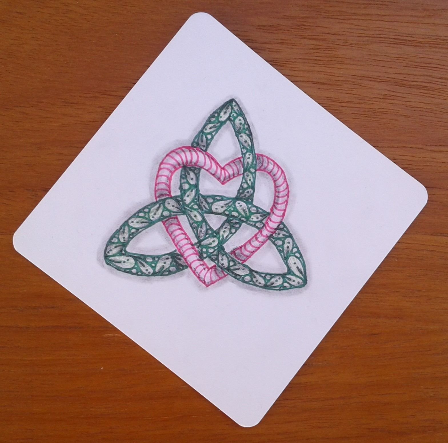
Happy St. Patrick’s Day! I was inspired by The Tireless Tangler to attempt a Celtic Sister Knot in honour of the day. A Celtic Sister Knot is a heart intertwined within a stylized triquetra or triple spiral. I drew mine on one of my YouTangle.art tiles with a green Sharpie and pink Staedtler Triplus fineliner shaded with a Mars Lumograph 8B pencil and blending stump. I added a little bit more greenness to the triquetra with a vintage Laurentien Lawn Green pencil crayon. The Triplus fineliner is water soluble so I could make the heart pinker just using a wet paintbrush. It was fun to make but I wish I had paid attention to the alignment of the heart to the tile. It looks sideways when holding the tile square.

Interlacing patterns go back to at least Roman times where they were seen in floor mosaics in the 3rd and 4th centuries AD. Interlacing knots can also be found in other cultures such as Byzantine architecture and book illumination, as well as Coptic, Islamic, and Ethiopian art. Ireland’s association with these motifs predates the arrival of Christian missionaries around 450 AD but Irish monks really elevated the artform when they incorporated beautiful interwoven designs into illuminated Christian manuscripts and artwork. The Book of Kells is an incredible example of the beauty and complexity of this form of decoration.

If the Celtic Sister Knot was a person, she would have only vaguely Irish roots but that wouldn’t stop her from donning a “Kiss Me I’m Irish” tee-shirt and drinking what no real Irish person would bring to their lips, green beer.