Yesterday was National Ballpoint Pen Day. It’s hard to get excited about this humble writing instrument but I remember fondly the Bic 4-Colour Multipen ballpoint I had when I was young. This fun pen was launched in the 1970s and apparently has been sold ever since. There have been changes in the design, for example there used to be a solid ball on top meant to represent the Bic boy head (I have a picture of him in my Bic Cristal post), a stylistic reference I’m sure was lost on me at the time. Now the ball is pierced so it can be worn on a cord around your neck. If that fashion statement is unappealing, you can attach it to your shirt with the pocket clip.
The ink colours have varied over the years as well. The one I found recently has four classic colours – black, blue, red and green. Having four ink chambers makes the pen rather fat to hold. Like all ballpoint pens, the ink is oil-based.
You can see how it works in this picture. The side button pushes down the coordinating ink chamber and it retracts by pushing down on any of the other buttons.
If a Bic 4-Colour Multipen were a person, they would be part of a clique that always travels together.
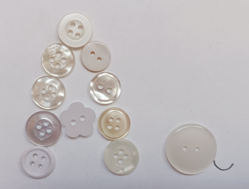
The Edmonton Calligraphic Society is doing a mix of in-person and zoom classes this year. November’s class was done through zoom on Button Lettering with Violet Symthe. She taught us Neuland last year and is a very good teacher as well as an excellent calligrapher.
When I first saw the list of classes for this year, I imagined Button Lettering to look something like this:
Fun fact: Since 1938, November 16th has been National Button Day in the USA.
In reality, this lettering style was given the button name by calligrapher Peter Thornton as he created it for name buttons for a calligraphy conference. It seems an unusual choice for this purpose as I don’t find it particularly legible but it does have a playful energy.
It is a fun lowercase lettering style that is perfect for broad-edged calligraphy tools like the Pilot Parallel pen or chisel-edged markers. However, there are not a lot of rules in this style and it can be adapted to a variety of writing instrument. Violet suggested going bigger is better with these letters and I agree. She loves to use a 6.0mmparallel pen but I only have a 3.8 mm one. It was really tricky trying to use the 2.5 mm Sanford calligraphic marker to write the alphabet, but that was partly because my marker is old and doesn’t have a sharp edge anymore. I tried button lettering using a variety of supplies.
If Button Lettering was a person they would be goofy and energetic. Sometimes they get so excited it’s hard to understand what they are saying.
When I saw a headline last week about Bic (officially called Société Bic S.A.) acquiring a temporary tattoo company, I thought a post on the Bic Cristal was long overdue.
The Bic Cristal is the classic ballpoint stick pen. With its clear hexagonal barrel designed to mimic the shape of a pencil and a simple cap the same colour as ink, it’s what comes to mind when we think of a ballpoint pen. The company refers to it as “iconic” and it is in the permanent collection of the Museum of Modern Art.
Before the Bic, ballpoint pens were expensive and prone to smearing and leaking. Marcel Bich realized the problem lay with the ink and worked with another company to come up with a formula that would work better in this type of pen. By the end of 1950, the new pen with its special ink was ready to be launched using a shortened version of his name. His grandson, Gonzalve Bich, is still running the company today.
Bic has always been smart about marketing. In 1961, it introduced the Bic Boy, with his school uniform and enormous ballpoint head, as their company logo. When I went to my gall nut ink workshop, the speaker brought items from his pen paraphernalia collection including a vintage Bic Boy pen holder.
It’s hard to get excited about this ubiquitous pen. Like many ballpoints it sometimes skips but I have to admit it is reliable. Mine is old and I hadn’t used it for a while but it started writing as soon as I tried it.
Of course, the Bic Cristal is not their only product. They make many kinds of pens and pencils, razors, and lighters, all of the disposable variety. The huge amount of plastic waste created is definitely a downside of Bic products.
One of Bic’s product lines is called their “human expression portfolio” which is where their recent acquisition of the Canadian temporary tattoo company, Inkbox, fits in. This connection to tattoos seems appropriate to me as their pens have been used for the permanent type of home (or jail) tattoos in the past. To see how this is done you can watch a weird movie from 2000, Memento, where a Bic Cristal is used by the main character to tattoo himself (don’t try this at home folks!).
If the Bic Cristal were a person, they would be the skinny older sister of the Bic Boy. She’s a terrible liar because you can see right through her and she is always losing her cap.
Despite this year’s lockdown due to COVID-19, or maybe because of it, the office supplies industry is still going strong. Now that many people are working and studying from home, they have to buy their own office and school supplies.
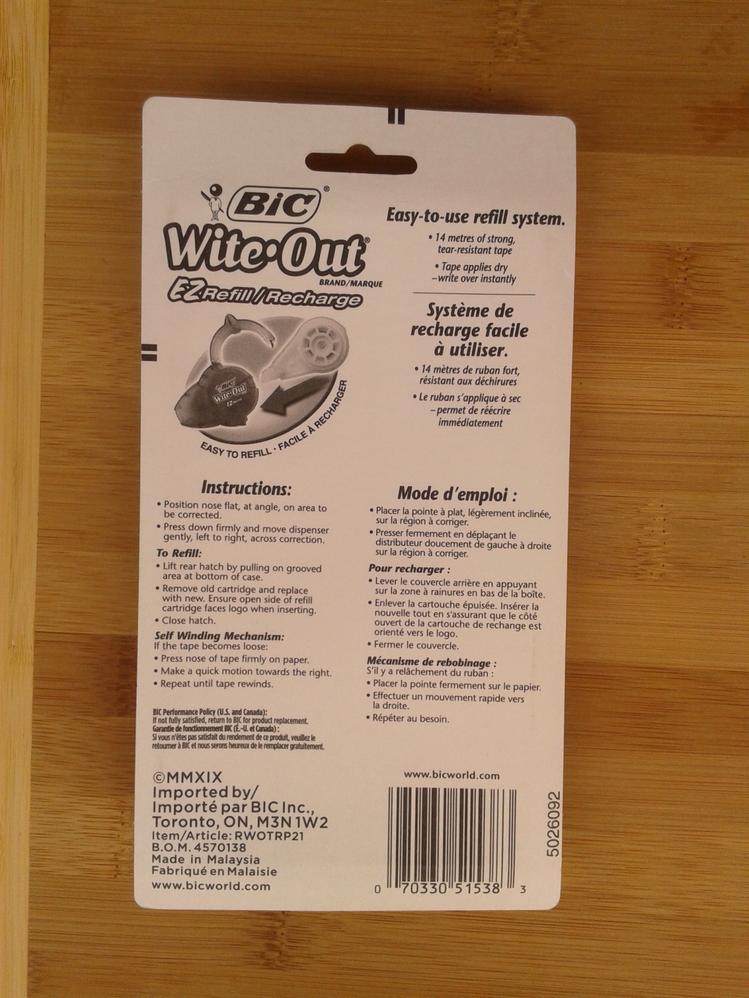
I myself ventured into the aisles of Staples not long ago. It seems like years since I last bought correction tape but it does eventually run out. I prefer the tape version to correction fluid which has a weird smell. I have also found it has a tendency to smear if you aren’t patient enough to let it dry thoroughly and the tape gives better coverage as ink sometimes bleeds through the liquid version. As I don’t use it often, the liquid would thicken and get clumpy. My frustrations with correction fluid were shared by the Japanese eraser manufacturer, Seed, who invented the pressure-sensitive correction tape in 1989.
Before that, Liquid Paper was the original correction fluid (first called Mistake Out), famously invented by Bette Nesmith Graham in 1956 in her kitchen. Although originally designed for typewriters, it now basically functions for most people as an eraser for pens. Wite-Out entered the correction fluid market in 1966 and was taken over by the BIC corporation in 1992. In Europe a brand called Tipp-Ex is the correction fluid of choice. Inspired by the success of Liquid Paper, Tipp-Ex was patented in Germany in 1958, but wasn’t manufactured for another seven years. Their version of correction tape comes in a mouse-shaped dispenser and is called the Tipp-Ex Pocket Mouse. In 1997, the BIC corporation bought Tipp-Ex too.
I pulled apart my old correction tape dispenser to see how it works. Correction tape is a coated strip of plastic wound around a spool. Different brands have different mechanisms but generally, as you press down on the dispenser, the coating comes off and sticks to the paper. On a BIC Wite-Out correction tape, the now uncoated plastic rolls up around an outer wheel. When I pulled apart my used-up dispenser, the uncoated plastic sprung out in a tangle.
Instead of buying a new container, I got a refill. There’s not a lot of cost savings involved in this but it seemed better than buying a whole other dispenser. It lived up to its EZ Refill name as it was very straightforward to do (open the package, lift the back hatch of the dispenser, and insert new cartridge).
If correction tape were a person, they would be neat and precise. Rather than admit a mistake, they just quickly cover up the evidence.
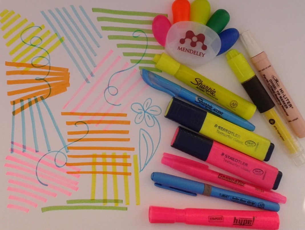
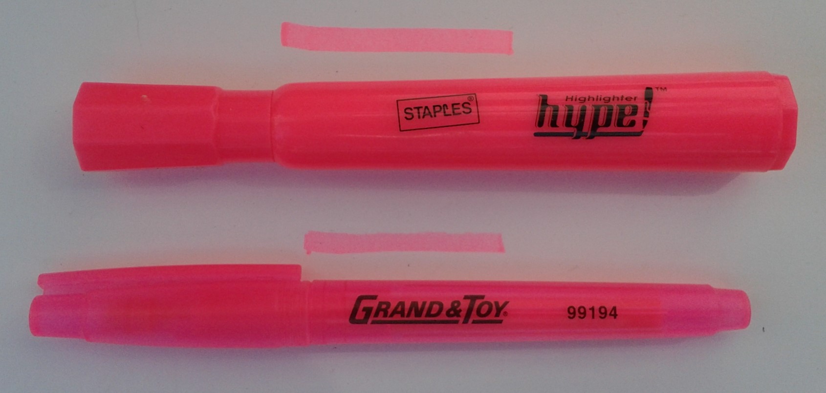
Not long ago I celebrated my 100th blog post so I have covered a lot of topics in the stationery world. However, there are a few gaps and one of those is highlighters. Like mechanical pencils, I don’t really like them but that doesn’t mean I don’t have some in my collection. All the major pen companies make them, as well as corporate brands like Staples and Grand & Toy, and they are a popular promotional item.
some of the Bic and Sharpie versions availablecorporate house brandspromotional novelty highlighter
It all started back in 1963, not long after felt pens themselves were invented. The first highlighters were produced by Carter’s Ink, based on Yukio Horie’s invention. It is not surprising an ink company had a major role in this innovation as getting just the right ink that would not obscure text, seep through the page, or smudge words is the key to the highlighter’s success. There were predecessors to Carter’s but they were the ones to see the potential in using this type of pen to highlight text and called their pen the Hi-Liter. The first colour sold was yellow and, along with pink, is still the most popular highlighter colour. Even the Microsoft Word highlighter tool defaults to yellow.
vintage Carter’s Hi-Liter
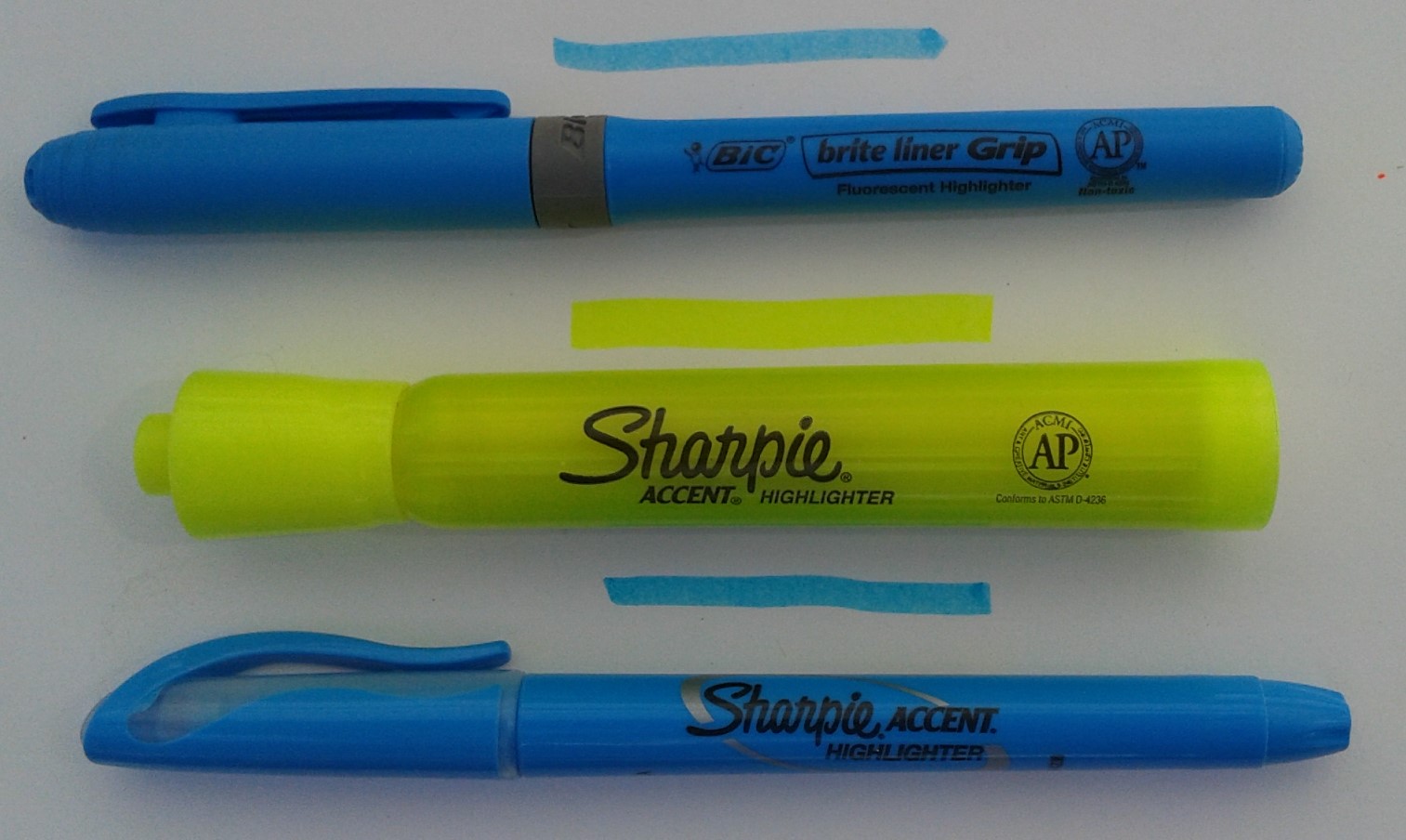
A lot of my highlighters are quite old so it doesn’t seem fair to do a comparison. I personally haven’t really found much of a difference in how they perform. They all feature a chisel tip which makes sense as it allows the user to vary the width of line depending on the size of the text. I do like the flattened design of the Staedtler Textsurfer which gives it a distinctive feel when you are digging around in a pencil case and stops it from rolling around on a desk. This shape follows the German tradition started by Stabilo, who first introduced a flat shaped highlighter.
Staedtler versions
If highlighters were people they would be obnoxious, wearing
loud colours, defacing library books (yes, that wicked!), and irritating those
around them. They try to give the impression they are studious but are really
not.